Leonardo da Vinci once said, “Simplicity is the ultimate sophistication,” and there’s no reason why digital web design should be any different.
If you’re thinking about creating a new website, or if your existing one just feels cluttered and difficult to navigate, then come join us on the path to the ultimate customer experience.
Your website is a reflection of your brand, and can easily have a negative effect as well as a positive one.
Web design isn’t about stuffing in as much as possible in a vain attempt to attract Google bots. As with everything your business does: it’s all about your customers. The web page design can be a bit like applying layer upon layer of makeup: you need to know when to stop. Excessive features and huge high-resolution imagery will have an impact on page load times and could stop potential customers from even entering your site in the first place.
In general, we have incredibly short attention spans, and we’ll ditch a slow-loading site within a couple of seconds. This applies just as much to large corporate website design as it does to a small business website.
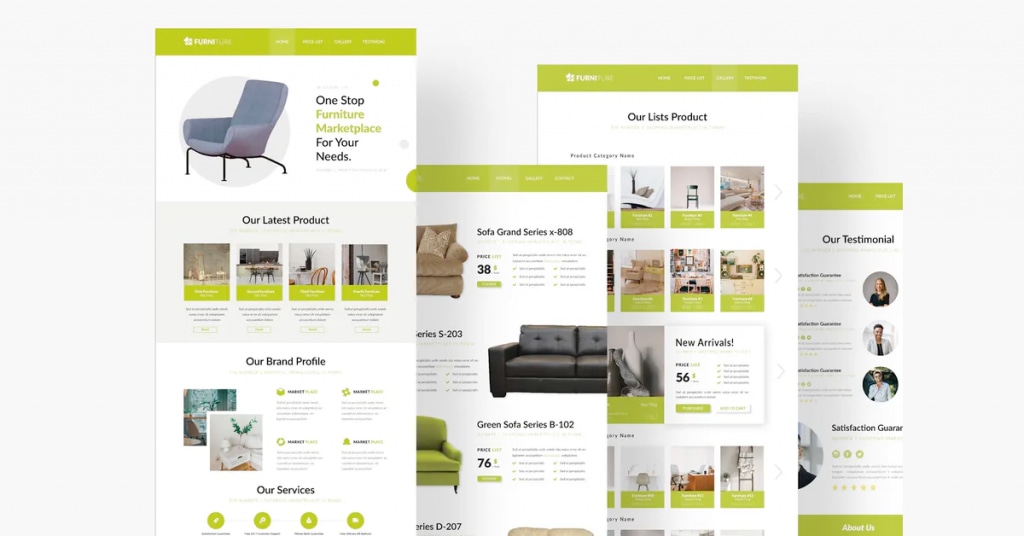
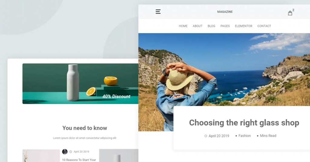
Before you dive straight into throwing every video, image and form you’ve ever created at your website, why not try a mockup website first?
Part of modern-day web design is seeing how your site looks and feels using certain templates. It’s a practical way to centre your ideas and not let them get out of hand.
Let’s take a look at some of the design features you should be focusing on to give your website the right energy and make it the valuable sales conversion tool that you always dreamed of.
Keep it clean
The first thing your customers need to know is how to find their way around your site.
Make the navigation clean, crisp and simple. Nobody wants to wade through 30-page links just to find your blog for example.
Make sure that promotional elements don’t block your site’s menu bar: website banner design and placement are important in the battle to keep everything clean and attractive for your customers.
The individual layout of each page is key. Let your visitor’s eyes move naturally around the content until you bring them to a deliberate stop where you want to attract their attention, and thus deliver your message.
Cramming visual obstacles everywhere will certainly hinder your conversion rates. Leave a clean space around the various elements on a page and give everything room to breathe.
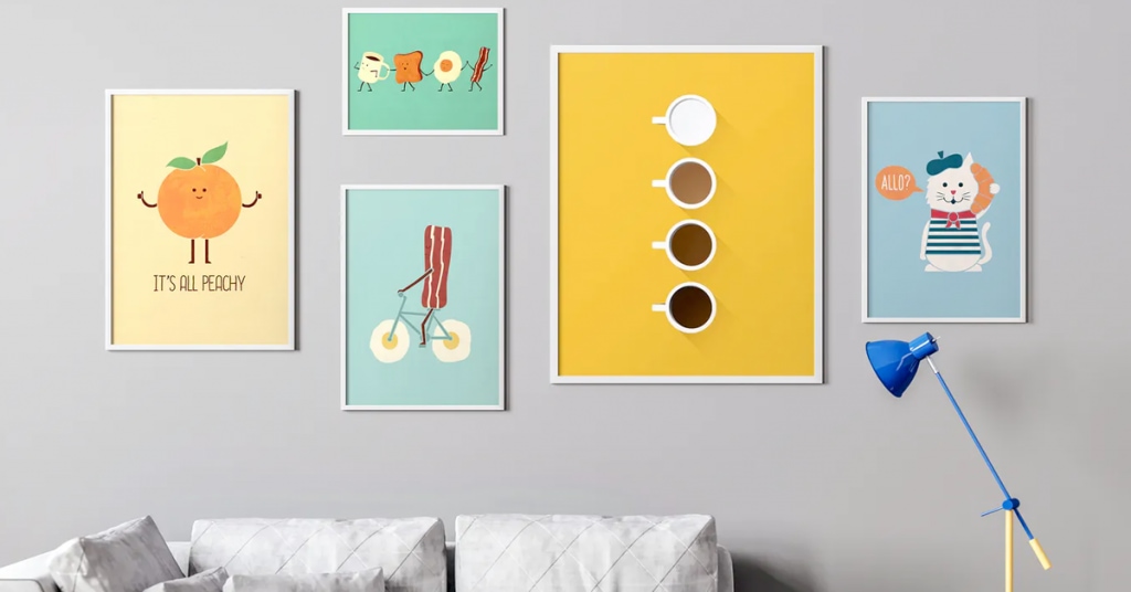
Have you ever wondered why an art gallery doesn’t have hundreds of paintings on each wall? It’s not because they’re trying to be pretentious, it’s because we need time and space to process things properly to fully appreciate them.
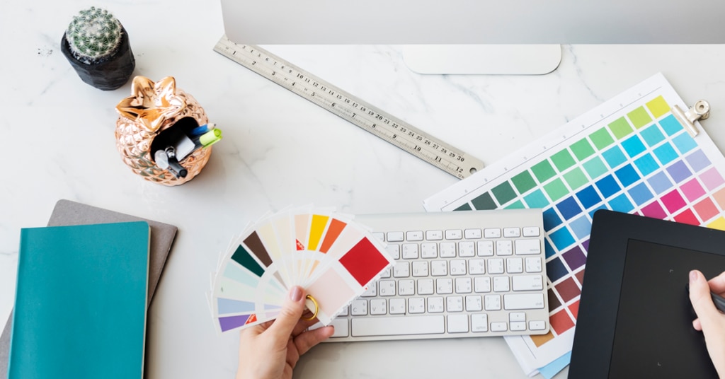
The power of colour
Years of research have gone into how we react to certain colours, and for good reason.
Your primary colours might be dictated by your company logo or corporate colour scheme, but if your existing colours are creating completely the wrong feel for your site, then it may be time to ask for help from a designer as these primary colours should be bold, impactful and used to draw the eye where you want them.
If you are looking for a design company in Malaysia, then get in touch with us for some expert guidance.
Consider what secondary colours may compliment your main palette as there might be times when you need to highlight slightly less important information on the site, but you don’t want to drag the visitor away at the wrong point. There are lots of colour generator available online to help strike the right balance.
It’s not just what you write, it’s how you write it
Remember that a reader’s eye is also drawn to larger, headline text; you don’t want to distract them unintentionally.
On the other hand, if you do want to guide a user towards a particular piece of information that could benefit your call to action, then a well-placed, larger font type can be a very useful tool. Don’t give your customers a headache as they make their way through a page.
Sans-serif fonts are easier on the eye and make your content more readable. Speaking of content: consider how your words are interacting with the reader.
Are you producing endless paragraphs stuffed with keywords? Does the tone of your writing convey the right feel for your target demographic? Sometimes very little needs to be said to express a thought and digital web design shouldn’t be any different.
It’s possible that an image or infographic could explain something far better than several paragraphs of explanatory data.
A picture paints a thousand words
As we said before, the use of images can dramatically impact on the loading speed of your site.
That’s not to say that images are bad; far from it. But, here are some things you should consider before turning your page into a sluggish collage wall.
Always start with a top-quality picture. Anything you do to your images will affect the quality little by little, and if it’s bad to start with, then it’s only going to get worse.
If you’re selling your own products, then use your own images. Stock images of homemade products won’t build trust with your audience.
Make sure you optimize the size and quality of your images for all devices, not just a giant desktop monitor. Customers won’t thank you for making your mobile site an unresponsive mess of A3 posters.
It can be difficult to know how to get it right, and sometimes it’s best to ask a professional for help. Our Malaysia web design company are there to assist if you need us.
Your website has the power to not only turn visitors into paying customers, but it can also have a negative effect if you get it wrong. People love to share their criticisms with everybody, more so than their compliments.
Don’t become infamous for being that company with an awful website; become synonymous with a beautiful, minimalist design that has their customers at the heart of everything they do.
#Digital Web Design
#UI/UX Design
#Simplicity