Apple's UI Design: Setting Trends for Decades
Apple has consistently revolutionised the design landscape with its groundbreaking approach to user interfaces, marking a significant chapter in the evolution of Apple UI design. Notable contributors like Susan Kare helped shape Apple’s intuitive products, which have become synonymous with ease of use.
Apple’s introduction of the App Store and its industry-leading mobile interfaces have further cemented its influence, continuously setting new standards in user experience. As Dominik Lyko noted, Apple has long surpassed its competitors by redefining mobile technology, emphasising simplicity and functionality as core principles. Apple’s ongoing innovations ensure that it remains a leader in the evolution of UI design.
The Genesis of Apple's User Interface
Early Innovations with the Macintosh
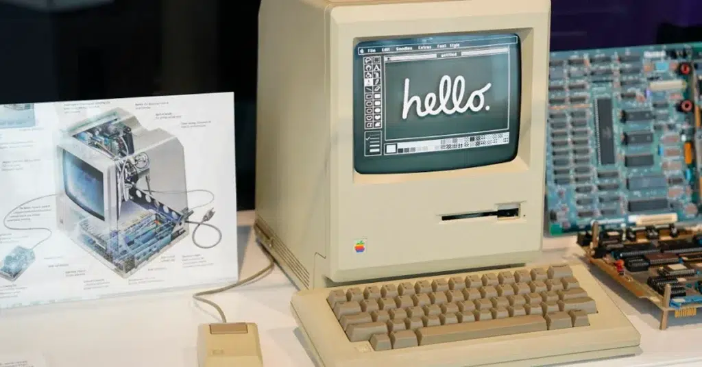
The introduction of the Mac in 1984 was a pivotal moment in personal computing. Apple’s graphical user interface (GUI) replaced complex text commands with easy-to-use icons and windows, transforming the way users interacted with computers. This intuitive design quickly became an industry standard, inspiring similar approaches across the tech landscape.
The Mouse: Revolutionising Input
The introduction of the mouse as an essential input device further enhanced the usability of the Mac. Users could now point, click, and drag, enabling a more natural interaction with the interface. This innovation became fundamental to computing and remains integral to the user experience today.

Steve Jobs' Design Vision
Visionary Leadership and the iPhone
Steve Jobs had a clear vision for the future of technology, one that focused on creating products that were not only functional but also elegant. The iPhone’s introduction in 2007 marked a significant shift in mobile technology, with its simple, touch-based interface emphasising ease of use and aesthetic appeal. Jobs believed that every product should prioritise the user experience, a philosophy that guided Apple’s design decisions.
Apple’s UI Design Evolution
From Skeuomorphism to Flat Design
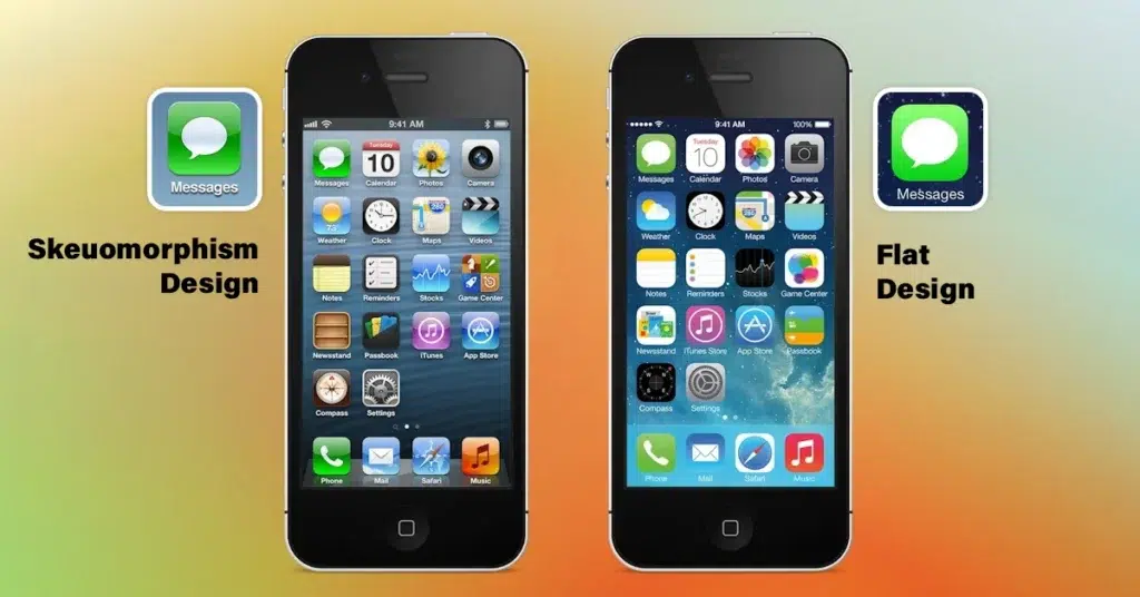
Apple initially embraced skeuomorphism, using real-world textures and objects in its digital interfaces to create familiarity. Apps like the calendar resembled paper calendars, making technology approachable and intuitive. However, with the release of iOS 7, Apple transitioned to flat design, favouring simplicity and minimalism over decorative elements. This shift not only emphasised functionality but also set a new trend in the industry, as other companies quickly adopted similar principles.
Key Design Principles
Simplicity and User-Centricity
Apple’s design philosophy has always centred on simplicity and intuitiveness. The company follows its Human Interface Guidelines, which stress clarity and ease of use, ensuring that all its products are approachable to users of varying technical skills. This user-centric approach is evident in Apple’s consistent design elements, creating a familiar and seamless experience across all devices.
Aesthetic Integrity and Functional Design
Apple’s attention to aesthetics doesn’t come at the cost of functionality. Each design element serves a clear purpose, ensuring that products are both beautiful and functional. This balance between form and function is a cornerstone of Apple’s design ethos, enhancing the user experience while maintaining visual appeal.

Technological Advancements in UI
The Touchscreen Revolution
The iPhone revolutionised mobile UI design with its intuitive touchscreen interface. Features like “Slide to Unlock” and Multi-Touch gestures, such as pinch-to-zoom, became instantly iconic. Apple’s attention to details like the “Rubber Band Effect” when scrolling added a layer of fluidity, further enhancing the user experience. These innovations set the benchmark for mobile devices worldwide.
The Integration of AI and Machine Learning
With the introduction of Siri in 2011, Apple integrated voice-activated assistance into its UI, allowing users to interact with their devices in new ways. Coupled with predictive text, which anticipates user inputs based on behaviour, Apple demonstrated its commitment to leveraging AI and machine learning to make user interactions smoother and more intuitive.

Apple’s Influence on Industry Trends
Setting Standards for User Experience
Apple’s focus on simplicity, functionality, and elegance has become a benchmark for user experience across the industry. Many companies have adopted Apple’s user-centric design principles, striving to emulate its success by prioritising intuitive and engaging interfaces. Apple’s App Store, in particular, has influenced how developers prioritise usability and aesthetics in app development, raising the bar for digital experiences globally.
Inspiring New Design Movements
Apple’s shift from skeuomorphism to flat design has sparked new movements, with minimalism becoming the prevailing trend in UI design. Google’s Material Design, which emphasises clean lines and vibrant colours, is one such example inspired by Apple’s influence. Adaptive interfaces that adjust to different devices and screen sizes also reflect Apple’s focus on consistency across its product ecosystem.

Future Directions in Apple's UI Design
Emerging Technologies: AR and VR
Apple continues to explore emerging technologies like augmented reality (AR) and virtual reality (VR). AR overlays digital content onto the real world, creating immersive experiences for users, while VR immerses users entirely in digital environments. Apple’s focus on developing intuitive interfaces for these technologies signals its commitment to revolutionising user interactions in new ways.
Sustainability in Design
In recent years, Apple has taken significant steps toward sustainability, using eco-friendly materials and emphasising energy efficiency in product design. This commitment reflects the company’s broader environmental goals, aiming to reduce waste and promote recycling while maintaining its dedication to cutting-edge innovation.

Lessons from Apple's Design Journey
Innovation, Adaptation, and Learning from Failures
Apple’s journey has been marked by a relentless drive for innovation. While the company has faced challenges and criticism for certain design choices, each failure has provided valuable lessons, driving continuous improvement. Apple’s iterative design process, which incorporates user feedback, has allowed it to refine its products with each new release, ensuring that it remains a leader in both hardware and software development.
The Importance of User Feedback
User feedback has been essential to Apple’s design approach. By engaging with its users through surveys and focus groups, Apple continuously gathers insights that inform future designs. This user-centred approach has not only fostered loyalty but also kept Apple at the forefront of technology and design innovation.


