
Responsive Web Design Overview
Responsive web design plays a crucial role in ensuring a seamless user experience across a variety of devices. It involves the creation of a responsive site that can adapt to different screen sizes and resolutions, providing a consistent and visually appealing experience for users. By implementing responsive web design, websites can be optimised for mobile devices, improving user engagement and overall performance.
This approach is essential for catering your website layout to the growing number of users accessing the internet through smartphones and tablets. With the increasing importance of mobile-friendly design, responsive web design mastery has become a cornerstone skill for enhancing user experience and ensuring that websites are accessible across various platforms.

1. Understanding Responsive Web Design
Importance of Responsive Design
Responsive design is pivotal in ensuring a consistent user experience across various devices, including desktops, laptops, smartphones, and tablets. With the increasing prevalence of mobile devices for internet browsing, adaptive web design has become essential for catering to the diverse needs of users. By embracing mobile-friendly design principles, websites can seamlessly adjust their layout and content to suit different screen sizes and resolutions. This adaptability not only enhances user satisfaction but also contributes to improved search engine rankings by aligning with mobile-first indexing requirements.
Key Principles of Responsive Design
Two key principles form the foundation of responsive web design: flexible grids and flexible images. A flexible grid layout allows website elements to resize proportionally based on the user’s device characteristics, ensuring a harmonious visual presentation across different screens. Flexible images further complement this approach to flexible layouts by adjusting in size relative to their container, maintaining visual integrity without compromising quality. Additionally, media queries play a crucial role in responsive design by enabling the adaptation of content based on specific device attributes such as screen width, orientation, and resolution.
2. Setting Up Responsive Web Design
Responsive web design is a crucial aspect of modern web development, and setting it up correctly is essential for ensuring a seamless user experience across various devices. In this section, we will explore the steps involved in setting up responsive web design.
Set the Viewport
The first step in setting up responsive web design is to set the browser width and viewport. The viewport is the area of the screen where the web page is displayed. To set the viewport, you need to add a meta tag to the head of your HTML document. The meta tag should include the following attributes:
name=”viewport”
content=”width=device-width, initial-scale=1.0”
The width=device-width attribute sets the maximum width of the viewport to the width of the device’s screen. The initial-scale=1.0 attribute sets the initial zoom level of the viewport to 1.0. This ensures that your web design will be displayed correctly on different devices, providing a consistent user experience across various screen sizes.
Using Media Queries for Responsiveness
Media queries are a powerful tool for creating responsive web designs. They allow you to apply different styles to your web page based on the screen width, device type, and other factors. To use media queries for responsiveness, you need to add a media query to your CSS file. The media query should include the following attributes:
@media
(max-width: 768px)
The @media attribute specifies that the styles inside the media query should only be applied when the browser window or screen width is less than or equal to 768px. This allows you to create a responsive design that adapts to different screen widths, ensuring that your web pages look great on both small and large screens.

3. Mobile Website Design
User-Centric Approach to Mobile Design
When it comes to mobile website design, adopting a user-centric approach is paramount for creating a seamless and engaging experience for visitors accessing the site on their smartphones and tablets. Here are some essential practices for optimising websites to be mobile-friendly:
Prioritise content and features based on mobile user needs: Understanding the specific requirements of mobile users is crucial for tailoring the website’s content and features. By identifying the most relevant information and functionalities for mobile visitors, you can ensure that they have quick access to what matters most to them.
Ensure intuitive navigation and touch-friendly elements for mobile users: Mobile devices rely heavily on touch interactions, so it’s essential to optimise the website’s navigation and interactive elements for touch-based inputs. Intuitive gestures and easily accessible menus contribute to a smooth browsing experience, enhancing user satisfaction.
Performance Optimization for Mobile
In addition to catering to user needs, optimising a website for mobile devices involves prioritising performance to deliver a fast and efficient browsing experience. Using responsive images is crucial to ensure that images load efficiently across various devices without negatively impacting site performance. Here are key strategies for performance optimization:
Minimise page load times to enhance mobile user experience: Mobile users expect swift loading times, making it imperative to streamline the website’s content delivery process. Optimising images, reducing unnecessary scripts, and utilising efficient coding practices are effective ways to minimise loading times.
Leverage caching and compression techniques for efficient mobile website performance: Implementing caching mechanisms allows frequently accessed resources to be stored locally on users’ devices, reducing the need for repeated downloads. Additionally, employing compression techniques such as WEBP compression can significantly decrease file sizes, leading to faster page loading on mobile devices.
By embracing a user-centric approach and focusing on performance optimization, websites can deliver an exceptional experience tailored specifically for mobile users.
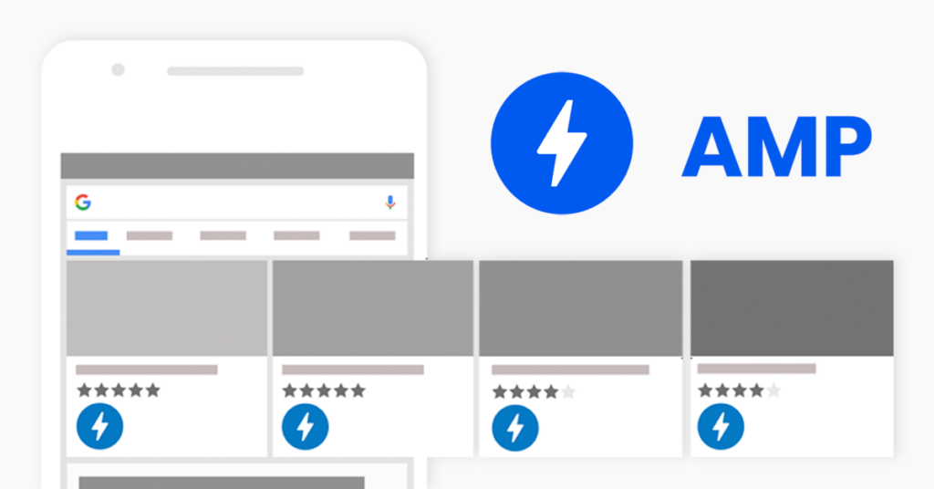
Photo by AMP on Google
4. Accelerated Mobile Pages (AMP)
Understanding AMP Technology
Accelerated Mobile Pages (AMP) is a cutting-edge framework designed to facilitate the creation of fast-loading mobile web pages. It prioritises speed and performance, aiming to enhance the overall mobile browsing experience for users. By leveraging streamlined coding practices and optimised resource delivery, AMP technology significantly reduces page load times, ensuring that mobile users can access content swiftly and seamlessly.
Implementing AMP for Mobile Optimization
Implementing AMP allows website owners to develop lightweight and efficient mobile pages that adhere to best practices for speed and performance. These optimised pages not only contribute to improved mobile search visibility but also lead to enhanced user engagement. With faster loading times and a focus on delivering high-quality content, AMP-optimised pages are well-positioned to provide an exceptional browsing experience for mobile users.

5. Effective CTA Button Placement
In the realm of mobile web design, strategic placement and optimization of call-to-action (CTA) buttons are pivotal for driving user engagement and conversions. When catering to mobile users, the design and positioning of CTAs play a crucial role in guiding visitors towards desired actions while ensuring a seamless browsing experience.
Strategic CTA Placement for Mobile
Prominent Positioning: CTAs should be strategically positioned to capture the attention of mobile users immediately upon accessing the viewport width a webpage. Placing them prominently within the viewport ensures that they are easily visible without requiring excessive scrolling or navigation.
Contrasting Colors and Clear Language: Utilising contrasting colours for CTAs helps them stand out against the background, drawing attention to their significance. Moreover, employing clear and concise language in CTA copy enhances their visibility and comprehension on mobile screens.
Optimising CTA Design for Mobile
Larger Touch Areas: Designing CTAs with larger touch areas is essential for accommodating various screen sizes and touch interactions on a mobile device. Ensuring that users can effortlessly interact with CTAs at varying screen resolutions contributes to a smoother browsing experience and encourages action.
A/B Testing for Effectiveness: Conducting A/B testing allows web designers to evaluate different placements of CTAs on mobile interfaces. This method enables them to determine the most effective position that resonates with mobile users, ultimately optimising conversion rates.
By strategically placing CTAs within the mobile interface and optimising their design for seamless interaction, websites can effectively guide users towards valuable actions while enhancing overall user experience.

6. Mobile UX Navigation Principles
Intuitive Navigation for Mobile Users
When designing the navigation system for mobile users, it is essential to prioritise clarity and conciseness. Clear and concise navigation menus play a pivotal role in ensuring that users can seamlessly explore the website without feeling overwhelmed by excessive options. By presenting a well-organised menu structure, mobile users can efficiently locate the information or features they are seeking, contributing to a positive user experience.
In addition to traditional menu structures, incorporating breadcrumb navigation and hierarchical arrangements further enhances the ease of navigation on mobile devices. Breadcrumb navigation provides users with a trail of links that indicates their path from the homepage to their current location within the website. This feature allows for intuitive backward navigation, enabling users to retrace their steps effortlessly. Similarly, hierarchical structures categorise content in a nested manner, allowing users to navigate through various levels of information systematically.
Gestures and Touch Interactions
Mobile UX design should embrace gestures and touch interactions to facilitate seamless navigation for users. Incorporating swipe gestures enables intuitive browsing experiences, allowing users to swipe horizontally or vertically to navigate between pages or sections of content. This gesture-based interaction aligns with the natural movements associated with touchscreen devices, enhancing user engagement.
Moreover, optimising touch targets is crucial for preventing accidental taps and enhancing overall user experience. By ensuring that interactive elements such as buttons and links have adequate spacing and size, websites can minimise errors caused by unintended touches. Optimised touch targets contribute to a frustration-free browsing experience, promoting user satisfaction and encouraging continued engagement with the website.

7. Typography Guidelines for Mobile Devices
Readability and Font Selection
When optimising typography for mobile devices, prioritising legibility is paramount to ensure an effortless reading experience for users. Choosing appropriate font styles and sizes plays a pivotal role in enhancing readability on smaller screens. Here are essential considerations for mobile typography:
Legible Font Styles: Selecting font styles that are clear and easy to read is crucial for mobile devices. Sans-serif fonts, such as Arial or Helvetica, are commonly preferred due to their font size and clean and straightforward appearance, making them well-suited for mobile screens.
Appropriate Font Sizes: Avoiding small font sizes and screen size is imperative to prevent strain on the reader’s eyes. Opt for larger font sizes that maintain readability without requiring excessive zooming or squinting. Adequate font sizes contribute to a comfortable reading experience, especially on the relatively compact displays of mobile devices.
Minimal Decorative Fonts: Excessive use of decorative fonts can hinder readability on mobile phones and screens. While decorative fonts may add visual flair, they can be challenging to decipher at smaller sizes. Limit the use of decorative fonts and prioritise clarity when selecting typefaces for mobile content.
Whitespace and Line Spacing
Utilising ample whitespace and appropriate line spacing significantly contributes to improved text legibility on mobile devices. Balanced typography enhances the visual appeal while ensuring ease of reading. Here’s how whitespace and line spacing impact mobile text legibility:
Ample Whitespace: Incorporating generous whitespace around text elements fluid images creates breathing room within the content layout, reducing visual clutter and enhancing focus. Adequate spacing between paragraphs and sections contributes to a clean and organised presentation, promoting an enjoyable reading experience.
Appropriate Line Spacing: Maintaining suitable line spacing prevents text from feeling cramped or overcrowded, allowing readers to navigate through content with ease. Well-spaced lines enhance readability by reducing eye strain and facilitating smooth progression through the text.
By carefully selecting legible font styles, optimising font sizes, and embracing balanced whitespace and line spacing, websites can elevate the readability of their content on mobile devices while delivering a visually appealing user experience.

8. Optimising Information Architecture for Mobile Usability
In the context of mobile web design, optimising information architecture is essential for ensuring a seamless and intuitive user experience. A well-structured information hierarchy and organised content layout contribute to efficient navigation and accessibility on mobile devices. Here are key considerations for optimising the information architecture to enhance mobile usability.
Simplified Information Hierarchy
Streamlining the layout structure of the content hierarchy is crucial for facilitating easy navigation and comprehension on mobile devices. By simplifying the information structure, websites can ensure that users can quickly locate relevant content without feeling overwhelmed by complexity. To achieve this:
Collapsible Menus and Expandable Sections: Implementing collapsible menus and expandable sections enables websites to present a condensed view of the navigation options while allowing users to expand specific categories or sections as needed. This approach minimises clutter on smaller screens, providing a focused and organised browsing experience.
Content Organization and Accessibility
Effective organisation and accessibility of content are pivotal for accommodating mobile users’ needs and preferences. Websites should prioritise logical grouping and implement features that enhance content accessibility on mobile devices. Consider the following strategies:
Logical Grouping and Categorization: Organise content into logical groupings based on relevance, topics, or functions to facilitate streamlined navigation for mobile users. Clear categorization enhances the discoverability of content, enabling users to access pertinent information with ease.
Search Functionality and Filters: Implementing robust search functionality allows mobile users to quickly find specific content or resources within the website. Additionally, integrating filters based on criteria such as date, relevance, or category empowers users to refine their search results, enhancing overall content accessibility on mobile devices.
By simplifying the information hierarchy and employing effective content organisation strategies, websites can optimise their information architecture for enhanced usability on mobile devices.

9. Implementing Responsive Web Design
Implementing responsive web design requires a combination of HTML, CSS, and JavaScript. In this section, we will explore the steps involved in implementing responsive web design.
Choosing Breakpoints
Breakpoints are the points at which your web page’s layout changes in response to changes in screen width. Choosing the right breakpoints is crucial for ensuring a seamless user experience across various devices. Here are some tips for choosing breakpoints:
Start with a small screen width: Begin with a small screen width (e.g., 320px) and work your way up to larger screen widths (e.g., 768px, 1024px). This approach ensures that your design is mobile-first and adapts well to larger screens.
Use a flexible grid system: Implement a flexible grid system to create a responsive layout that adapts to different screen widths. Fluid grids allow your web design to resize proportionally, maintaining a harmonious visual presentation.
Utilize media queries: Apply different styles to your web page based on the screen width using media queries. This technique allows you to fine-tune your design for various devices, enhancing user satisfaction and improving the overall user experience.
By following these tips, you can create a responsive web design that adapts to different screen widths and devices, ensuring a seamless and engaging experience for all users.
10. Web Accessibility and Inclusivity
Importance of Web Accessibility
Ensuring web accessibility is crucial for providing equal access to information for all users, including those with disabilities. It aligns with ethical and legal standards, promoting inclusivity in digital experiences. By prioritising web accessibility, websites can cater to diverse user needs and contribute to a more equitable online environment.
Creating Inclusive Mobile Experiences
Implementing accessible design practices is essential to accommodate diverse user needs on mobile devices. Consideration of colour contrast, provision of alt text for images, and enabling keyboard navigation are pivotal for enhancing mobile accessibility. Embracing inclusive design principles not only fosters a welcoming digital environment but also reflects a commitment to serving all users effectively.
Web Accessibility: Web accessibility ensures equal access to information for all users. It aligns with ethical and legal standards, promoting inclusivity in digital experiences.
Mobile Inclusivity: Implementing accessible design practices is essential for mobile inclusivity. Consideration of colour contrast, alt text for images, and keyboard navigation enhances the mobile experience.
Key Takeaways
Embracing responsive web design is crucial for ensuring a seamless and consistent user experience across a wide array of devices, including desktops, laptops, smartphones, and tablets. Responsive sites involve the creation of mobile-friendly and adaptive web pages that can adjust their layout and content to suit different screen sizes and resolutions.
Implementing mobile optimization strategies such as AMP (Accelerated Mobile Pages) technology and strategic CTA (call-to-action) button placement plays a pivotal role in engaging mobile users effectively. By prioritising fast-loading mobile optimized web pages through AMP implementation and optimising CTA design for mobile interfaces, websites can enhance user engagement and drive valuable actions from mobile visitors.
Prioritising web accessibility is essential for fostering inclusivity and ensuring equal access to digital content for all users. By adhering to accessible design practices and considering diverse user needs, websites can contribute to a more equitable online environment while providing an exceptional browsing experience for individuals with disabilities.
Hiring professional web designers like WDD Malaysia ensures your website stays abreast with the latest in mobile technology. These experts bring invaluable experience and up-to-date techniques to the table, making your site not just responsive, but cutting-edge. Opting for professional design is a wise decision for keeping pace with evolving mobile trends.