Ever thought about how people really use your website? Heat maps can show you exactly that, in the most colourful way possible. Imagine seeing where visitors click, scroll, or even ignore your page—it’s like having a cheat code to understanding your audience through heatmap data!
Sorting out your website’s navigation is key to keeping people happy and engaged, and with heat maps, you can pinpoint what’s working and what’s not. It’s all about making smart, data-driven tweaks to improve those underperforming areas. So, dive into the world of heat maps—it’s like unlocking the secret menu of user interaction!
Understanding Heat Maps
What Are Heat Maps?
Heat maps provide a visual representation of how users engage with a webpage. They use colours to show different levels of activity, with warmer hues like red highlighting areas of high interaction, while cooler tones like blue point to less active zones. Heat maps are an excellent way to gain insight into where users click, scroll, or hover, allowing you to see what grabs their attention and what doesn’t.
Types of Heat Maps
There are several types of heat maps, each offering its own set of insights. Click maps reveal the most frequently clicked areas on your site, highlighting what draws users in. Scroll maps show how far down a page users scroll, helping you determine whether important content is being missed. Mouse-tracking maps follow the movement of the cursor, giving you a sense of user focus and engagement. By analysing these maps, you can make informed decisions to enhance user experience.
How Heat Maps Work
Data Collection Methods
Heat maps gather data through a heatmap tool, which is specialised tracking software that monitors user interactions on your website. This software records where users click, scroll, and move their cursor. Once collected, the data is processed into a visual format, allowing you to see behavioural patterns in real time. This immediate feedback helps you make data-backed decisions to improve website performance.
Interpretation of Website Heatmap Data
Interpreting website heatmap data is all about paying close attention to the details. High-activity areas, often marked in red or orange, point to popular content or effective design elements. In contrast, zones with minimal interaction might need adjustments to boost engagement. These insights guide you in refining navigation and overall user experience, ensuring your site meets visitor expectations effectively.
The Role of Website Heatmaps in Visualising User Behaviour

Gaining a deeper understanding of how visitors interact with your website can revolutionise your design approach. Heat maps, which track user interactions, offer a unique perspective into user behavior. They provide real-time insight into where users click, scroll, or pause, empowering you to make informed decisions about your website’s layout and content.
Heat Maps Tracking User Click and Scroll Interactions
Click Maps
Click maps visually display the areas where users click the most. By identifying which buttons, links, or sections attract the most attention, you can assess the effectiveness of your design. A cluster of clicks in a specific area signals success, while areas with fewer clicks may require improvement. Click maps give you a direct view of user engagement, highlighting what’s working and what needs tweaking.
Scroll Maps
Visitors spend varying amounts of time scrolling down a page, and scroll maps show how far they go, allowing you to determine if they’re engaging with important content or losing interest early on. These maps help gauge user interest, especially in relation to where key content is placed. If important information remains unseen, it might need repositioning for better visibility. Scroll maps offer guidance in optimising content placement to keep visitors engaged and ensure critical information is not overlooked.
Identifying and Understand User Preferences
Heat Map Analysis Techniques
Analysing heat maps requires a keen eye for spotting patterns in user behaviour on a web page. By examining clicks, scrolls, and cursor movements, you can identify which areas of your website attract the most attention. These popular spots reflect user preferences, while sections with less activity may signal a need for redesign. Through effective heat map analysis, you can tailor your website to better meet user needs, ensuring a more engaging and intuitive user experience.
Case Studies of User Behaviour
Real-world case studies demonstrate the tangible benefits of using heat maps to understand the behavior of website visitors. Many companies have successfully leveraged heat maps to increase engagement and conversion rates.
For example, a business might discover that users consistently skip over important content, prompting adjustments to layout or positioning. Implementing changes based on heat map insights often results in enhanced user experience, proving how practical and impactful this tool can be in shaping a website’s effectiveness.
Identifying Effective Call-to-Action Placements

Importance of Website Call-to-Actions Data
Call-to-actions (CTAs) are pivotal in directing users toward specific goals, whether it’s making a purchase, signing up for a service, or engaging with content. Heat maps provide invaluable insights into where these CTAs should be placed for maximum impact.
By observing where users focus their attention, particularly in areas of high activity, you can identify prime spots for CTAs. Placing them strategically in these high-traffic zones can significantly enhance user engagement and guide them toward taking the desired actions.
Heat Map Insights for CTA Placement
Heat maps showcase patterns of user interaction, pinpointing hotspots where users tend to click frequently. These high-activity areas offer ideal locations for placing CTAs. When positioned effectively, a CTA can dramatically improve conversion rates, turning casual browsers into active participants. Leveraging heat map data ensures that CTAs are placed in the most visible and engaging parts of your site, making it easier for users to act on your offers.
Examples of Successful CTA Strategies
Companies have achieved notable success by thoughtfully positioning CTAs based on heat map insights. One common approach is placing a prominent CTA near the top of a page, where it captures user attention early on. Another effective strategy is using contrasting colours to make the CTA stand out visually. Real-world examples show how these strategies, combined with heat map analysis, lead to increased conversions and better overall website performance.
Testing and Optimising Website CTAs for Conversion Revenues
Testing and optimising call-to-actions (CTAs) is essential for ensuring they achieve maximum impact. A/B testing, combined with heat maps, offers valuable insights into user interactions. By comparing different CTA placements and designs, you can determine which version drives more engagement. This data-driven approach allows for informed decisions, helping you enhance the effectiveness of your CTAs.
A/B Testing with Heat Maps
A/B testing involves creating two variations of a webpage, each featuring a different CTA placement or design. Heat maps track how users interact with both versions, providing a clear visual comparison of which CTA garners more clicks. This method allows you to refine your CTA strategies based on actual user behaviour, ensuring the final choice is the most effective.
Continuous Improvement Strategies
To keep your CTAs performing at their best, continuous improvement is key. Regularly reviewing heat map data helps you stay on top of shifts in user behaviour. By making adjustments to CTA placements and designs over time, you ensure your website remains optimised for user engagement, driving ongoing improvements in conversion rates.
Revealing User Engagement Patterns for CRO Improvements

Understanding how users interact with your website is crucial for reshaping your design strategy. Heat maps provide a visual breakdown of user behaviour, revealing which areas draw the most attention and which are overlooked. These insights enable you to make informed, strategic decisions that enhance the overall user experience and boost engagement.
Analysing Engagement Metrics and Quantum Metrics
Time Spent on Page
The time users spend on a page is a key indicator of interest. Heat maps that track time can pinpoint sections where visitors linger, signalling engaging content. Conversely, areas with less time spent may need adjustments to capture more interest. By leveraging this data, you can fine-tune your content to maintain user attention and encourage deeper interaction.
Interaction Hotspots
Interaction hotspots are areas where users engage the most. Heat maps tracking clicks and movements can reveal these high-activity zones, highlighting popular buttons, links, or images. Understanding what captures user attention allows you to enhance these areas, creating a more satisfying and interactive experience for visitors.
Enhancing User Experience via Attention Insights
Tailoring Content Based on Engagement
Customising content according to user engagement levels significantly improves the overall experience. Heat maps that track engagement offer insightful data, revealing which content truly resonates with visitors. By adjusting and aligning your content with user preferences, you keep them more engaged and interested. Personalised content not only captures attention but also enhances user satisfaction, creating a more meaningful connection with your audience.
Improving Navigation Flow
A well-structured navigation flow is essential for providing a seamless user journey. Heat maps that track navigation patterns help uncover friction points where users may struggle. Identifying these areas allows you to refine the navigation structure, ensuring users can browse effortlessly. Streamlining the flow based on this data keeps users engaged and encourages them to return, offering a smoother, more intuitive experience.
Implementing Heat Maps for Website Optimisation
Website Heatmaps Software and Tools
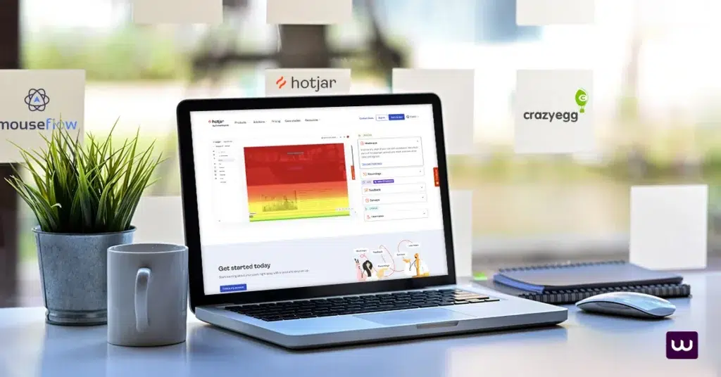
To fully explore the potential of heat maps, selecting the right website heatmap tool is essential. Popular options like Hotjar, Crazy Egg, and Mouseflow each offer distinct features tailored to your needs. Hotjar provides comprehensive insights with click, scroll, and move maps, allowing you to visualise user engagement in real time.
Crazy Egg focuses on A/B testing and user recordings, helping you experiment with different designs and content placements. Mouseflow tracks entire user sessions, offering detailed reports that capture every interaction. Choosing the right tool depends on your specific goals, but each can elevate your website optimisation efforts.
Integration with Google Analytics Platforms
While heat maps provide excellent standalone insights, their true power comes when integrated with web analytics tools. Pairing heat maps with Google Analytics offers a dynamic view of user behaviour, helping you track how engagement affects conversions.
Similarly, Adobe Analytics integrates seamlessly, enabling a deeper understanding of user interactions and patterns. By combining these tools, you gain a holistic view of your website’s performance, empowering you to make more informed, data-driven decisions for optimisation.
Best Practices for Using Heat Maps Features
Setting Clear Objectives
Before diving into heat map analysis, it’s essential to establish clear objectives. Ask yourself what specific insights you’re hoping to gain—whether it’s improving navigation, increasing conversions, or refining content placement.
Clear goals allow you to focus on the most relevant data and avoid getting overwhelmed by the finer details. Without defined objectives, you may find yourself analysing information that doesn’t support your core needs. Setting these goals upfront ensures you’re maximising the benefits of heat maps.
Regular Monitoring and Updates of Web Page
Heat maps are most effective when used as part of an ongoing strategy. User behaviour can shift over time, and regular monitoring helps you stay ahead of these changes. By frequently checking your heat maps, you can track new patterns or shifts in interaction, allowing you to make timely updates to your site.
This proactive approach ensures that your website remains optimised for user engagement. Continuous analysis and adjustments based on the latest data will help maintain long-term success and keep your website aligned with user preferences.
Actionable Insights and Recommendations

Steps to Get Started with Heatmap tools
Initial Setup and Configuration
Getting started with heat map tracking is straightforward. Begin by selecting the right tool for your needs, such as Hotjar or Crazy Egg, both of which offer robust features for tracking user behaviour. Once you’ve chosen your tool, install it on your website following the setup instructions provided.
Make sure it’s configured to track all the necessary pages and interactions, whether it’s clicks, scrolls, or mouse movements. Defining specific goals, such as improving navigation or enhancing engagement with key content, will help focus your analysis. Once set up, you can start gathering valuable data about how visitors interact with your site.
Analysing Initial Results
As data begins to accumulate, the real insights come to light. Start by examining your heat maps to spot areas with high levels of user activity—these are the sections where users are most engaged. Conversely, pay attention to low-activity zones, as they may signal issues with design or content placement.
Use these insights to make informed adjustments, such as repositioning important content or smoothing out navigation. By addressing friction points and focusing on user behaviour, you can make data-driven decisions that enhance the overall user experience and encourage more meaningful interactions with your website.
Long-term Benefits of Using Heatmap Data
Heat maps provide lasting advantages when it comes to optimising website navigation. By regularly reviewing the data, you can detect emerging trends in user behaviour. As user preferences evolve over time, your website should adapt to meet those changing needs.
Heat maps allow you to continuously refine layouts, addressing new friction points as they arise, ensuring a smoother, more intuitive user journey. An optimised navigation structure not only keeps visitors engaged but also enhances their overall experience, leading to higher satisfaction and longer site visits.
Enhanced User Satisfaction
Effective use of heat maps significantly boosts user satisfaction. By tailoring content based on user engagement data, you can personalise the experience to align with user preferences. Visitors appreciate websites that cater to their needs, and when the experience feels seamless and relevant, they’re more likely to return.
Positive experiences also contribute to increased conversion rates. Using heat map insights to continually enhance user experience fosters a satisfied user base, which is key to long-term success.
Create a Website Heatmaps Plan
Heat maps offer a powerful lens through which to understand user behaviour on your website. By tracking where users click, scroll, and engage, you gain critical insights that help improve navigation and overall user experience.
This data-driven approach guides you in optimising your site for better engagement, ultimately leading to increased user satisfaction. Implementing heat maps is a strategic step toward unlocking the full potential of your website, ensuring continued success and a stronger connection with your audience.