Websites have proven to be invaluable resources, especially after the COVID-19 pandemic. With so many businesses barely surviving to meet their bottom line, many have resolved to take to online marketing and implement sales strategies through the website or e-commerce.
This article will provide insights into common mistakes and flaws found in bad website design examples, helping you avoid these pitfalls in your own web design efforts.
A notorious example of poor web design choices is the ‘Big Ugly Website,’ which highlights issues like lack of navigation, unattractive fonts, and overwhelming animations.
Website design has increasingly become a beacon of hope for business owners around the world. Many had literally felt its intangible visibility yet able access to larger audiences, target markets and getting back to business as usual.
It remains an excellent tool to reduce running costs because most services offered and operations are made through online meetings. Additionally, it offers great convenience as one can work from home.
With these great benefits and more, here are some mistakes you should avoid when building or optimizing your website according to the latest website design trends 2025 list to prevent bad website design.
Understanding Poor Website Design

Bad websites can be identified by several common characteristics that contribute to a poor user experience. These include poor website design, cluttered interfaces, inconsistent branding, and a lack of mobile-friendliness.
A website’s design is significant in attracting and retaining visitors, and even poorly designed websites can still draw traffic. However, such issues can negatively affect user experience, leading to high bounce rates and decreased conversions, ultimately harming a business’s online presence and reputation. Recognizing these traits is crucial for businesses aiming to improve their websites and attract more potential customers.
By addressing these common pitfalls, you can ensure your website stands out for the right reasons and provides a seamless experience for users. A well-structured website’s navigation enhances user experience and can lead to increased customer attraction and retention.
What Makes a Website Bad?
A website can be considered bad for several reasons, each contributing to a poor user experience and diminished online presence. One of the primary culprits is poor navigation. Poor navigation can be particularly detrimental to an ecommerce site, leading to user frustration and increased bounce rates.
When users struggle to find what they need due to a confusing or difficult-to-use navigation system, frustration sets in, leading to a high bounce rate. Another significant issue with bad websites is an outdated design. Websites that look like they haven’t been updated in years can give the impression that the company is not keeping up with the times or is unwilling to invest in its online presence.
Lack of mobile responsiveness is another major flaw. In today’s mobile-first world, a website that isn’t optimized for mobile devices can alienate a large portion of potential users, resulting in a poor user experience and high bounce rates. Slow loading times are equally detrimental. Users expect websites to load quickly, and any delay can lead to frustration and abandonment.
Poor content is another hallmark of a bad website. Content that is irrelevant, poorly written, or not engaging can fail to capture the user’s interest, leading to a lack of engagement and high bounce rates.
Additionally, too much clutter on a web page can overwhelm users, making it difficult for them to find the information they need. Lastly, the absence of clear calls-to-action (CTAs) can leave users unsure of what steps to take next, resulting in lower engagement and conversions.
The Impact of Bad Website Design
A bad website design can have far-reaching consequences for a company’s online presence and bottom line. One of the most immediate impacts is a high bounce rate. When users quickly leave a website due to poor design, it signals a lack of engagement and a negative user experience.
This can also lead to a low conversion rate, as users are less likely to take desired actions, such as making a purchase or filling out a form. Poorly designed web pages with cluttered layouts can hinder navigation and comprehension, leading to a high bounce rate.
Search engines prioritize user experience, and a website that frustrates users is likely to be ranked lower, resulting in decreased visibility. This can further compound the problem by reducing organic traffic and potential leads.
A negative user experience can also erode trust in the company. Users may perceive a poorly designed website as a reflection of the company’s overall professionalism and reliability. This loss of trust can lead to a decline in business and revenue, as potential customers turn to competitors with more user-friendly websites.
In summary, bad website design can lead to a cascade of negative effects, including high bounce rates, low conversion rates, poor search engine rankings, and ultimately, a loss of business and revenue.
Non-Mobile Friendly Web Design

On average, 70% of all online searches in Malaysia are performed using smartphones, as mobile searches tend to last longer than desktop searches. Mobile responsive web design trends may be attributed to its portability and affordability to a larger percentage of the population in comparison to desktop devices.
A bad website with non-mobile-friendly web design will definitely hinder the efforts of potential clients to access your site information, consequently, leading to the loss of opportunity to tap into a potential market. This is especially true for a news website, which relies on engaging users with content while maintaining a user-friendly interface.
Slow Loading Page

Slow loading pages can be both frustrating and time-consuming to any person searching online, and thus create a negative customer experience. People desire to always have quick and effective search results. Slow loading pages can also negatively impact search engine rankings.
Slow loading pages inhibit consumers from quickly transiting between pages to sample all the needed relevant information, content or images.
Poor Website Navigation
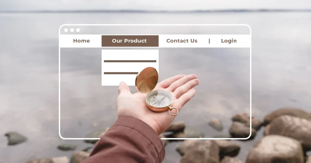
Website navigation enables you to guide your reader’s path. Professional web designers usually incorporate an array of features to enable ‘intuitive navigation design’. This form of navigation helps a visitor to access the needed website pages with ease and direct. A well-designed search bar is also crucial for efficient user navigation.
On the contrary, poorly organized website elements can lead to a confusing navigation system, causing many potential users to get ‘stranded’ – clueless about getting to the products pages from the webpage they currently are on.
Information Architecture Best Practices
Information architecture is crucial for creating a user-friendly website that is easy to navigate and understand. One of the best practices is to keep web pages simple and well-structured. A straightforward navigation and content structure can significantly enhance the user experience.
Clear and concise labels for navigation and content are also essential, as they help users quickly understand where they are and what they can find on the website. Using a consistent structure throughout the website is another key practice.
Consistency helps users feel more comfortable and confident as they navigate, knowing that they can expect the same layout and design elements on each page. Incorporating breadcrumbs is a helpful way to show users their current location within the website and provide an easy way to backtrack to previous pages.
A well-placed search bar is indispensable for any website. It allows users to quickly find specific content without having to navigate through multiple pages. By following these best practices, website owners can create a more organized and user-friendly experience, ultimately leading to higher engagement and satisfaction.
Cluttered Interface

A cluttered interface is a hallmark of bad websites and can be a significant deterrent for users. When a web page is overloaded with too many different fonts, too many images, and excessive text, it becomes overwhelming and difficult to navigate. This can frustrate users and lead to a high bounce rate.
A well-designed website should feature a clear and concise layout, utilizing plenty of whitespace to guide the user’s attention effectively. By using white space and avoiding a cluttered interface, you can enhance user engagement and ensure visitors can easily find the information they need.
A one page website can avoid clutter by consolidating essential information into a single, well-organized page.
Inconsistent Design

Inconsistent design is another common issue that plagues bad websites. When a website lacks uniformity in branding, fonts, and colors, it can confuse users and diminish their trust in the site. A well-designed website should maintain a consistent design throughout, establishing a clear brand identity and visual hierarchy.
This consistency helps build credibility and ensures a cohesive user experience. By addressing design inconsistencies, businesses can improve their online reputation and foster a sense of reliability among their audience.
For example, a specific website dedicated to tag team signs suffers from poor design elements, slow loading times, and a lack of mobile compatibility, leading to a negative user experience.
Outdated Design Patterns
Outdated design patterns can make a website look old and unprofessional, which can negatively impact user perception and engagement. One of the most glaring examples is the use of Flash. Once a popular technology, Flash is now considered obsolete and can make a website appear dated. Similarly, using tables for layout is an outdated practice that can result in a clunky and unattractive design.
Frames are another design element that should be avoided. They can create a disjointed user experience and are no longer considered best practice in modern web design. Animated GIFs, while sometimes used effectively, can often make a website look amateurish if overused or used inappropriately.
Overuse of JavaScript can also be problematic. While JavaScript is a powerful tool for adding interactivity to a website, excessive use can lead to slow loading times and a cluttered appearance. By avoiding these outdated design patterns, website owners can ensure their sites look modern, professional, and user-friendly.
No 404 page
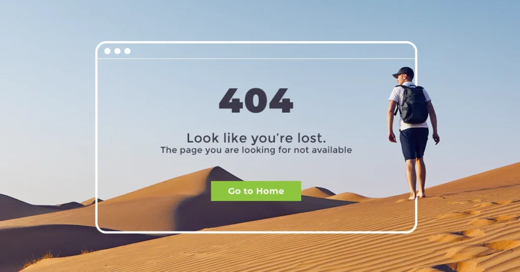
Surprisingly these were not part of the web design trends until recently. A 404 page is popularly referred to as a ‘Not Found’ page. It could either caused by the content was moved to other pages completely lost, link changed or being deleted.
Information on this 404 page is essential to redirect users back to the home page or even better, suggest what is the closest to what they are looking for. No proper 404 design or information will lead to potential customers exit.
Protip: A simple button to link back to the homepage will help in your SEO ranking.
Missing H1 tags-Especially on the Homepage Affecting Search Engine Rankings

An H1 tag or Heading tag is a title affixed to any piece of content. It’s the headline used to introduce the content as descriptive as possible. A poorly designed website often lacks clear H1 tags, which can negatively impact user experience and usability.
This feature helps the users to determine the context of the section before reading it and it has positive effects on the level of your SEO ranking to rank higher than your competitors. Missing H1 tags will inevitably decrease your ranking and lead to a ‘puzzled’ audience, who may not precisely be getting the best idea of what they are viewing.
Large Image File Sizes

Images are the face of any website. It increases the aesthetic value of the website, draws attention and fosters engagement with your customers. In turn, they attract more organic traffic to your site and increase your SEO rank.
However, inserting large image file sizes may limit the enjoyment of these benefits, despite challenging for the best quality. Some creative agency still tends to ignore this fact. Large images may take up lots of web space and slow down your website.
For all our websites projects, our designers usually scan through this Photoshop resizer, to provide the best user experience. Websites with inconsistent design and random elements can end up being just a mess in terms of user experience.
Pop-Ups Distractions and Cluttered Interface

Unless you are really giving 90% off and closing down your store, then this may be a good idea – especially for an e-commerce website.
No people would want their browsing experience to be interrupted with a brands’ pop-up that tells them of a sale or an event coming up, especially if when pop-ups are irrelevant to them. It’s annoying! The worst website examples often feature intrusive pop-ups and cluttered interfaces that frustrate users.
No Visible CTAs

One of the most critical mistakes in bad websites is the absence of visible calls-to-action (CTAs). CTAs are essential for guiding users towards specific actions, such as filling out a form, subscribing to a newsletter, or making a purchase.
Without clear and visible CTAs, users may feel lost and unsure of what steps to take next, leading to lower conversions and decreased user engagement. A well-designed website should feature prominent CTAs with concise and compelling messages, ensuring users can easily navigate and complete desired actions. By incorporating effective CTAs, businesses can enhance user experience and drive better results.
Text in Images

Text in images may be a great idea to grab the attention of a new brand name among many famous brands. However, this works only during peak branding campaigns and may prove detrimental if overdone. Stuffing images with text and keywords may lead to a lower SEO rank as ‘stuffed’ images may be considered as SPAM. Google algorithms read the embedded metadata and interpret the same. It is important that all branding agency know how SEO works.
Infinite Scrolling

A website page can be disavowed from a search engine results because search engines, especially Google, do not scroll through pages that incorporate this feature. Using an infinite scrolling layout on your website leads to the continuity of slow loading of redundant contents.
Essentially, this means content only loads as you scroll. Good website designs should incorporate alternative features such as pagination which enable the webpages to be analyzed and indexed according to the Google bots ways.
All Content in 1 Page

Having all your contents squeezed into one page gives a congested look and affects the overall presentation of your website design. Yes, we know it is cheaper for business, but it does not benefit your users. A website developer should apply personal judgment and thought to avoid simply following trends in design choices.
Some of the world’s worst websites serve as cautionary examples of what not to do, particularly when it comes to cramming all content onto a single page.
Well laid out pages should provide information in ‘palatable’ portions. It should include the division of contents into subheadings and using backlinks to link other related webpages to the current one. These features will minimize the risk of putting everything on one main page, that may diminish customers’ interest due to the difficulty of finding what they desire ‘amidst’ all the clutter.
Templated Design

A well-designed website should cater to the exact needs of the company. It should be unique and tailor-made for that type of business. A premade template, however affordable, lacks these features. Even prestigious institutions like the Yale University School of Art can suffer from poor website design, highlighting issues such as lack of responsiveness and inadequate navigation.
Templates are designed to blanket the needs of a company. It lacks versatility and is replicative. A majority of free template designs fail to measure the changing SEO algorithm and prepare to get out of trends in no time.
Such a shortcoming an ugly website will adversely affect your ranking and company plans in the long run. This is a common issue seen in some of the worst websites, where poor design and user experience lead to outdated aesthetics and navigation difficulties.
Frustrating Interactions
Frustrating interactions can significantly impact user experience and lead to a high bounce rate. Imagine clicking on a button that doesn’t respond or waiting endlessly for a page to load—these are the kinds of experiences that drive users away. A website with frustrating interactions can make users feel annoyed, confused, or even angry, which is the last thing you want for your business.
Common examples of frustrating interactions include unresponsive buttons or links, slow loading times, unclear or confusing navigation, inconsistent design elements, and a lack of feedback or confirmation. These issues can make users feel lost and unsure of what to do next, leading to a poor user experience and high bounce rates.
To avoid frustrating interactions, prioritize user experience and conduct thorough testing. This includes usability testing to ensure that all elements of your website are functioning correctly and accessibility testing to make sure your site is usable for everyone. By identifying and addressing frustrating interactions, you can improve user satisfaction and increase conversions.
Unhelpful Feedback
Unhelpful feedback can be a significant obstacle to user experience. When users encounter errors or issues, they expect clear and concise feedback to help them resolve the problem. However, unhelpful feedback can lead to confusion, frustration, and even abandonment.
Some common examples of unhelpful feedback include vague or generic error messages, lack of clear instructions or guidance, inconsistent or unclear language, and insufficient information or context. For instance, an error message that simply says “Something went wrong” without any additional information leaves users puzzled and unsure of how to proceed.
To provide helpful feedback, prioritize clarity, consistency, and user-centered design. Use clear and concise language, provide relevant information and context, and ensure consistent design elements. For example, if a user enters an incorrect password, a helpful error message might say, “Incorrect password. Please try again or click ‘Forgot Password’ to reset it.” This approach not only informs the user of the issue but also guides them on how to resolve it.
Walls of Text
Walls of text can be overwhelming and intimidating for users. When faced with large blocks of text, users may feel hesitant to read or engage with the content, leading to a high bounce rate and negatively affecting user experience. In today’s fast-paced digital world, users prefer content that is easy to scan and digest.
Common examples of walls of text include long paragraphs, lack of headings or bullet points, insufficient white space, and unclear language. These elements can make your content appear dense and uninviting, causing users to leave your site in search of more accessible information.
To avoid walls of text, prioritize scannable content and user-friendly design. Use headings, subheadings, and bullet points to break up content, provide sufficient white space to give the text room to breathe, and ensure clear and concise language. By making your content more readable, you can enhance user engagement and keep visitors on your site longer.
Ignoring Accessibility
Ignoring accessibility can have significant consequences for users with disabilities. When a website fails to cater to diverse user needs, it can lead to exclusion, frustration, and even legal issues. Accessibility is not just a nice-to-have feature; it’s a necessity for creating an inclusive online environment.
Common examples of ignoring accessibility include lack of alt text for images, insufficient color contrast, inconsistent or unclear navigation, and lack of closed captions or transcripts for multimedia content. These issues can make it difficult or impossible for users with disabilities to access your content, leading to a poor user experience and potential legal ramifications.
To prioritize accessibility, follow web accessibility guidelines and conduct thorough testing. Ensure clear and consistent navigation, provide sufficient color contrast, include alt text for images, and offer closed captions or transcripts for multimedia content. By making your website accessible, you can reach a broader audience and create a more inclusive online experience.
By addressing these common web design mistakes, you can ensure your website provides a seamless and enjoyable experience for all users, ultimately leading to higher engagement and better business outcomes.
Conclusion on Web Design Trends Malaysia

In 2025, the internet search and website landscape in Malaysia is bound to be more competitive due to the drastic increase in the number of ‘players’.
Search engines will be more inclined to introduce more stringent and robust algorithms to rank websites. The changes are bound to be fast-paced, continuous, and will have much effect on your website visibility. Instead of worrying about these intricate technicalities, leave it to the experts. Do consider hiring a reputable web design Malaysia company that will build and optimize your website to your exact needs and ensure a continuous high SEO ranking to serve these folks. Additionally, reviewing bad websites examples can provide valuable insights into common design flaws to avoid.


