
In an era where mobile devices are ubiquitous, responsive web design has become essential. This approach ensures that web pages display optimally across various devices, adapting to screen sizes from mobile phones to desktops, making the website mobile friendly. It’s crucial for maintaining accessibility and user-friendliness across diverse browsing habits.

The Basics of Responsive Web Design
The essence of responsive web design lies in its unique approach to web development and design, one that ensures a seamless user experience across a multitude of devices. At its heart, it’s about designing for the multitude of screens, primarily focusing on mobile devices and desktop devices.
When designing for a mobile device, the aim is to create a website that is not just visually appealing but also highly functional and easy to navigate on a smaller screen. This involves considering how users interact with a mobile phone, such as the use of touch-based navigation and the visibility of content on smaller displays, ensuring a smooth mobile browser experience. The design must ensure that key information is readily accessible, with an interface that adapts to the unique constraints and capabilities of mobile devices.
Conversely, when the design is viewed on desktop devices, the layout should expand comfortably, making use of the additional screen real estate without appearing sparse or stretched. This is where the concept of a responsive website becomes crucial. It dynamically adjusts the layout, images, and content based on the screen size, whether it’s being viewed on a mobile phone or a desktop monitor.
A responsive website also factors in the varied user environments of mobile phones and desktops. Mobile friendly sites cater to on-the-go users who require quick, efficient access to information with minimal loading times and intuitive navigation. This user-centric approach is key in responsive web design, ensuring that whether a user visits a site on a mobile phone or a desktop device, their experience is optimised for that particular medium.
By employing responsive design techniques, web designers and developers create a singular site that is versatile and adaptive, negating the need for separate mobile and desktop versions. This not only streamlines the development process but also ensures a consistent and unified user experience across all devices. The ultimate goal of responsive web design is to create websites that are effective, efficient, and enjoyable, regardless of the device used to access them.

Benefits of Having a Responsive Website
Responsive web design is an approach to web development that ensures a website’s layout, content, and visual elements adapt seamlessly to different screen sizes, devices, and orientations. In today’s digital landscape, where mobile devices account for a significant portion of internet traffic, having a responsive website is no longer optional—it’s essential.
A responsive website dynamically adjusts to the screen size of the device being used, whether it’s a mobile phone, tablet, or desktop computer. This adaptability is crucial for providing an optimal user experience, which in turn leads to increased engagement, higher conversion rates, and improved search engine rankings. By ensuring that your website is responsive, you cater to the diverse needs of your audience, making your site accessible and user-friendly across all devices.
Having a responsive website offers numerous benefits that can significantly impact your online presence and business success:
Improved User Experience: A responsive website ensures that users can easily navigate and access content on various devices, leading to increased engagement and satisfaction. Whether your audience is browsing on a mobile phone or a desktop, they will have a seamless and enjoyable experience.
Increased Conversion Rates: A mobile-friendly website can improve conversion rates, as users are more likely to complete desired actions on a website that is easy to use. By providing a smooth and intuitive user experience, you can encourage visitors to take actions such as making a purchase, signing up for a newsletter, or filling out a contact form.
Enhanced Search Engine Rankings: Search engines, such as Google, prioritize mobile-friendly websites in their search results. This means that having a responsive website can lead to improved visibility and credibility, helping you attract more organic traffic and potential customers.
Cost-Effective: A responsive website eliminates the need for separate mobile and desktop versions, reducing development and maintenance costs. By investing in a single, adaptable site, you can save time and resources while ensuring a consistent user experience across all devices.
Technical Aspects of Responsive Design
Responsive design’s technical foundation is built on a combination of HTML, CSS, and client-side scripting, which work together to create a dynamic and adaptable web experience. The key to this lies in media queries, a feature of CSS that allows content to adapt to different conditions such as screen size, resolution, and browser width.
Additionally, the viewport meta tag is crucial in controlling the viewport’s width and scaling, ensuring that websites display correctly on different devices. Media queries are essential in implementing responsive web design. They function by querying the characteristics of the device and then applying specific predefined CSS styles if those conditions are met. For instance, a media query might check the browser width of a device and apply a different set of CSS rules for a mobile phone screen compared to a desktop screen. This approach is vital in ensuring that a website is mobile responsive.
CSS plays a central role in responsive design, providing the styles and layouts that change based on the media queries. It allows web pages to automatically adjust their layout, typography, and graphical elements to best fit the viewing environment. This adaptability means that whether a site is accessed from a mobile device or a desktop, the user interface will reconfigure itself accordingly, maintaining the functionality and aesthetic integrity of the responsive website.
HTML structures the content on the web page, but it’s the CSS and media queries that dictate how this structure looks on different devices. The fluid layouts employed in responsive design are a significant aspect of this. Unlike fixed-width layouts, fluid layouts use relative units like percentages rather than absolute units like pixels. This makes the layout more adaptable to different screen sizes, ensuring that elements on the page expand or shrink in relation to each other to fill the available space.
In addition to media queries and fluid layouts, responsive design often involves setting CSS rules for automatically adjusting images and other media. This ensures that they scale up or down smoothly to fit within the confines of the device’s screen size without causing layout issues or excessive scrolling.
Overall, the technical aspects of responsive design revolve around creating a responsive website that ensures usability and consistency across different devices and screen sizes. The seamless integration of HTML, CSS, and media queries, along with strategies like fluid layout and automatic adjustments, are what make websites truly responsive and user-friendly, no matter the device.

Design Considerations for Responsive Web Pages
Designing for mobile responsive websites requires a holistic approach where flexibility and adaptability are key. When crafting a responsive website, designers must account for the vast array of devices that users might employ, from smartphones and tablets to laptops and desktops. This diversity necessitates a design that is fluid and responsive across all platforms.
A central element in this design process is the use of flexible images. These images need to scale seamlessly across different devices, ensuring they contribute positively to the user experience rather than hindering it. Whether viewed on smaller devices or larger screens, these images should adjust in size without losing clarity or distorting the layout.
Equally important are flexible grids. These grids are the framework of the design, providing a structural layout that can expand or contract based on the browser size. Unlike traditional fixed-width layouts, flexible grids are measured in relative units like percentages, which makes them more adaptable to the varying screen sizes of devices.
Fluid grids take this concept further, allowing for more dynamic resizing and layout adjustments. They work in tandem with flexible images and CSS media queries to create a cohesive and responsive layout. The use of max-width settings ensures that content and images do not stretch beyond their intended size, maintaining the integrity of the design regardless of screen size.
When designing for mobile versions of websites, special consideration must be given to elements like the search bar and navigation menus to ensure a user-friendly mobile site. On a mobile device or tablet, screen real estate is limited, and these elements must be designed to be easily accessible without overwhelming the limited space. This often involves simplifying the design and prioritising essential content and features.
The responsive design also calls for an adaptable approach to typography and button sizes, ensuring legibility and ease of interaction across all devices. The goal is to create a user interface that is as intuitive and efficient on a mobile version as it is on a desktop version.
Designing responsive web pages involves a deep understanding of the various screen sizes and capabilities of modern devices. By employing flexible grids, fluid grids, flexible images, and strategic CSS, designers can ensure that their websites are fully responsive, providing an optimal experience whether accessed via a mobile, tablet, or desktop.

Principles of Mobile-First Design
Mobile-first design is an approach to web development that prioritizes the mobile user experience from the outset. The principles of mobile-first design include:
Simplifying Content and Navigation: Mobile devices have limited screen real estate, so it’s essential to prioritize content and simplify navigation. This means focusing on the most important information and making it easily accessible, while minimizing clutter and unnecessary elements.
Using Clear and Concise Language: Mobile users are often on-the-go, so clear and concise language is crucial for effective communication. Ensure that your content is straightforward and easy to understand, allowing users to quickly grasp the key messages.
Optimizing Images and Media: Large images and media files can slow down mobile websites, leading to a poor user experience. It’s essential to optimize these elements for mobile devices, ensuring they load quickly and do not hinder the overall performance of the site.
Focusing on Key Functionality: Mobile users often have specific goals in mind, so it’s essential to focus on key functionality and eliminate unnecessary features. Prioritize the critical functions that users need, such as search bars, contact forms, and call-to-action buttons, to enhance usability and satisfaction.
Challenges and Solutions in Responsive Design
Responsive design, while offering numerous benefits, also brings its own set of challenges, particularly when creating mobile responsive websites that need to function across a wide range of devices.
One of the primary challenges is ensuring that the website is equally mobile responsive across various devices. This involves designing for the smallest mobile device to the largest desktop screen. The variability in screen sizes means that elements like font size must be adaptable – large enough to be readable on a mobile device, but not overwhelmingly large on a desktop.
Another significant challenge is the variability in browser windows and browsing habits. A website that looks perfect in one browser window may appear distorted in another due to differences in browser rendering. The max-width property becomes crucial here, as it limits the width of elements and prevents them from stretching beyond their original size on larger screens. This ensures that the style and layout remain consistent regardless of the browser window size.
Designers must also consider how users interact differently when they browse on mobile versus desktop. Mobile browsing is often done with one hand, requiring easy accessibility and intuitive navigation. This is where the design needs to cleverly resize and reposition elements for optimal usability.
Creating a mobile responsive website also entails ensuring that images and other media retain their quality and functionality when resized. The challenge here is to allow these elements to scale down for smaller screens without losing their original size’s clarity and impact.
Additionally, web designers must tackle the complexities of different operating systems, browsers, and device capabilities. Ensuring compatibility across this spectrum can be daunting, as each combination can potentially alter how a website is displayed and functions.
While responsive design is essential in today’s digital landscape, it comes with its fair share of challenges. Successfully overcoming these challenges involves a deep understanding of the nuances of different devices, browsers, and user behaviours. This often involves simplifying the design and prioritizing only the critical functions to enhance usability and satisfaction. By addressing these aspects – from font size and max-width properties to browser window variability and mobile browsing considerations – designers and developers can create truly mobile responsive websites that offer a seamless and consistent experience across all platforms.

Common Mistakes to Avoid When Optimizing for Mobile Devices
When optimizing a website for mobile devices, there are several common mistakes to avoid to ensure a seamless user experience:
Not Using a Mobile-Responsive Theme or Template: A mobile-responsive theme or template is essential for ensuring a website adapts to different screen sizes and devices. Without it, your site may not display correctly on mobile devices, leading to a frustrating user experience.
Not Optimizing Images and Media: Large images and media files can slow down mobile websites, leading to longer load times and a poor user experience. Ensure that all visual elements are optimized for mobile devices to maintain fast loading speeds and high-quality displays.
Not Simplifying Content and Navigation: Mobile devices have limited screen real estate, so it’s essential to simplify content and navigation. Avoid cluttered layouts and complex menus, and focus on making key information easily accessible.
Not Testing on Multiple Devices: Testing a website on multiple devices is crucial for ensuring a consistent user experience across different devices and screen sizes. Make sure to test your site on various mobile phones, tablets, and browsers to identify and fix any issues that may arise.
By avoiding these common mistakes, you can create a mobile-optimized website that provides a smooth and enjoyable experience for all users, regardless of the device they are using.
The Future of Web Design: Embracing Mobile Devices
The focus on mobile responsiveness is intensifying. Today, having a responsive website is a necessity given the growing use of smartphones and the introduction of new devices.
In addition, website speed is a crucial factor that significantly affects user experience and search engine rankings.
The landscape of web design is continually evolving, and a significant driver of this evolution is the rise of mobile devices. As we look to the future, the concept of mobile responsive web designs becomes not just a trend but a fundamental aspect of web development.
The growing prevalence of mobile phones has already brought noticeable differences in how websites are designed and interacted with. Users expect a seamless experience whether they are browsing on a desktop or a mobile device, and the challenge for designers is to meet these expectations without compromise.
In mobile responsive web designs, the approach is to start with the smallest screen and scale up, ensuring that the site functions perfectly across all devices. This approach is evident in the way elements resize and reorganise themselves based on the browser window size. For example, a multi-column layout on a desktop might transform into a single-column layout on a mobile phone, making it easier for users to navigate and read content.
Another aspect where mobile responsive design is making its mark is in the realm of user interfaces. The differences in how users interact with a desktop versus a mobile device are significant. On mobile phones, the interaction is more direct and tactile, often requiring bigger touch targets and simplified menus. This has led to innovative design solutions that cater to touch interactions without sacrificing aesthetic appeal or functionality.
The future of web design also sees a shift in prioritising mobile-first strategies. This means designing for the smallest screen first and then scaling up to larger screens. Such an approach ensures that the core content and functionality are accessible to everyone, regardless of the device they use.
As technology continues to advance, we can expect to see web designs that are not only responsive but also more intuitive and aligned with the unique capabilities and limitations of mobile devices. The emphasis will be on creating experiences that are not just visually appealing but also extremely user-friendly, adaptable, and responsive to the evolving needs of mobile users.
Embracing mobile devices in web design is about acknowledging and adapting to the changing landscape of internet usage. The future of web design lies in creating mobile responsive sites that are not just a scaled-down version of their desktop counterparts but are thoughtfully designed to provide an optimal experience across all platforms.

Responsive Web Design in Medium to Large Companies
In the context of medium to large companies, the integration of responsive web design is becoming increasingly critical. These companies, which often have a diverse and extensive customer base, need to ensure that their online presence is effectively optimised for a range of devices, from desktop computers to mobile phones and tablets.
The concept of mobile responsiveness is at the forefront of this requirement. As the use of mobile devices for internet access continues to rise, companies must adapt their websites to be as functional and user-friendly on a small screen as they are on a larger desktop display. This adaptation is not just a matter of scaling down content; it involves rethinking the design to ensure that it remains intuitive and accessible on a phone or tablet.
Companies can use a free online tool to compress images without losing quality, ensuring faster loading times and better performance on mobile devices.
In terms of user interaction, the difference in screen sizes poses a unique challenge. On small screens, such as those of phones or tablets, the amount of visible content is reduced, necessitating a design that prioritises key information and functionality. Navigation menus, call-to-action buttons, and other interactive elements need to be easily accessible, ensuring that users can navigate the site with the same ease as they would on a larger screen.
For medium to large companies, this focus on mobile responsiveness is not just about providing convenience to users; it’s a strategic move to enhance customer engagement and retention. As users increasingly rely on various devices to access information and services, a responsive website becomes an indispensable tool in maintaining a competitive edge.
Furthermore, considering the diversity of devices used to access the internet, companies need to ensure that their websites perform seamlessly across all platforms. This includes not only phones and tablets but also emerging devices with varying screen sizes and capabilities. The goal is to create a cohesive user experience that adapts fluidly to whatever device is being used.
In conclusion, for medium to large companies, the implementation of responsive web design is a strategic necessity. It’s about ensuring that their digital presence is robust, adaptable, and capable of meeting the needs of a diverse user base that accesses the internet through a variety of devices, including phones, tablets, and beyond. By prioritising mobile responsiveness, these companies can ensure that their websites are not just accessible, but also engaging and effective, regardless of how or where they are accessed.

Role of a Web Designer in Responsive Web Design
In responsive web design, the role of a web designer is pivotal, especially in creating mobile responsive interfaces. Web designers must understand the nuances of different devices and screen sizes, ensuring that the design maintains its integrity and usability across various platforms. They utilise the max-width property effectively to ensure that page elements do not stretch beyond their intended width, maintaining a consistent appearance and function.
The difference in user interaction between desktop and mobile devices requires a thoughtful approach to design. Designers must consider how a page will reorganise and display on smaller screens, ensuring that the user experience is seamless and intuitive. Their skill lies in crafting designs that are visually appealing and functional, catering to the diverse needs of mobile and desktop users alike.

Role of a Web Developer in Implementing Responsive Design
Web developers implement the designs into functional websites. They write the code that makes the website operate, often working closely with designers to ensure the technical feasibility of designs. In responsive web design, developers play a crucial role in coding the structures that allow for flexibility and responsiveness.
Their expertise lies in coding and developing the backend functionalities that enable a website to adapt seamlessly to various screen sizes. When focusing on smaller screens, developers use HTML and other scripting languages to ensure that the website’s structure and content dynamically adjust to provide an optimal viewing experience. This involves meticulous coding to ensure that elements such as navigation menus, images, and text are responsive and function well on all devices. A web developer’s skill in responsive coding is essential in creating a website that not only looks good but also performs efficiently across different devices, ensuring a consistent and friendly user experience.
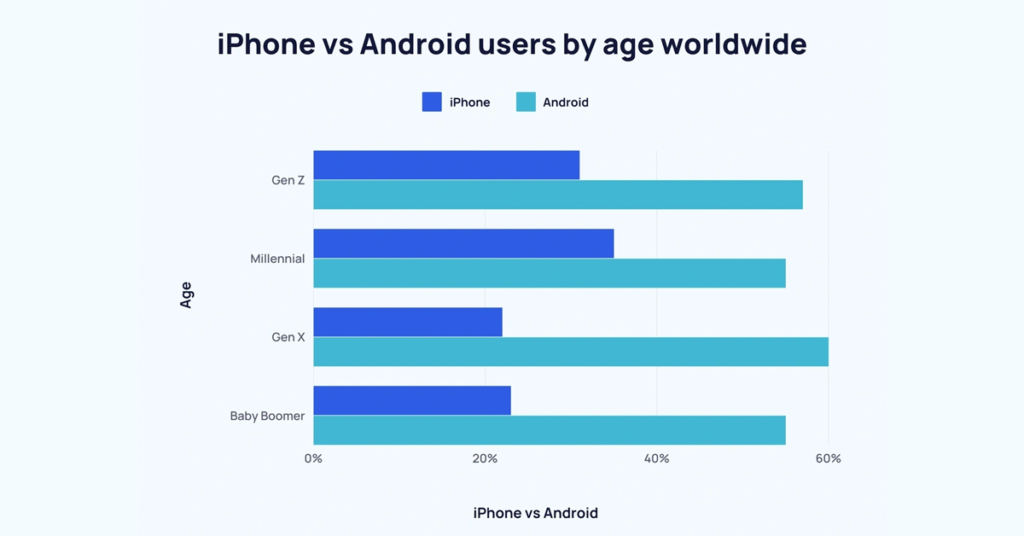
Photo by Explodingtopics.com
Data and Statistics on Mobile Device Usage: iPhone and Android
Recent data and statistics reveal a significant shift in mobile usage patterns, particularly among iPhone and Android users, underscoring the need for mobile responsive design. This trend directly impacts how websites are developed and optimised. A significant portion of internet traffic now originates from mobile devices, making it crucial for any website to be mobile responsive. This means that websites must be designed and coded to look and function effectively on the smaller screens of iPhones and Android devices.
The user experience on these devices is a key metric for the success of a website, as a growing number of users prefer to browse, shop, and interact online via their mobile devices. Adapting to this shift is not just beneficial but essential for businesses and organisations that aim to stay relevant and accessible to their audience.

Photo by Domenico Loia
Update Mobile Optimized Website
Responsive web design is a critical standard in today’s web development. As technology evolves, the ability of websites to adapt to any screen size, from mobile devices to desktops, becomes more crucial. Embracing responsive design is fundamental for businesses to stay relevant and competitive in the digital age.
If you are looking to update your website to responsive design, please do not hesitate to contact us at WDD Malaysia web design company. Our team of expert designers and developers are dedicated to creating websites that are not only visually appealing but also highly functional across all devices, ensuring a seamless and engaging user experience for your audience.