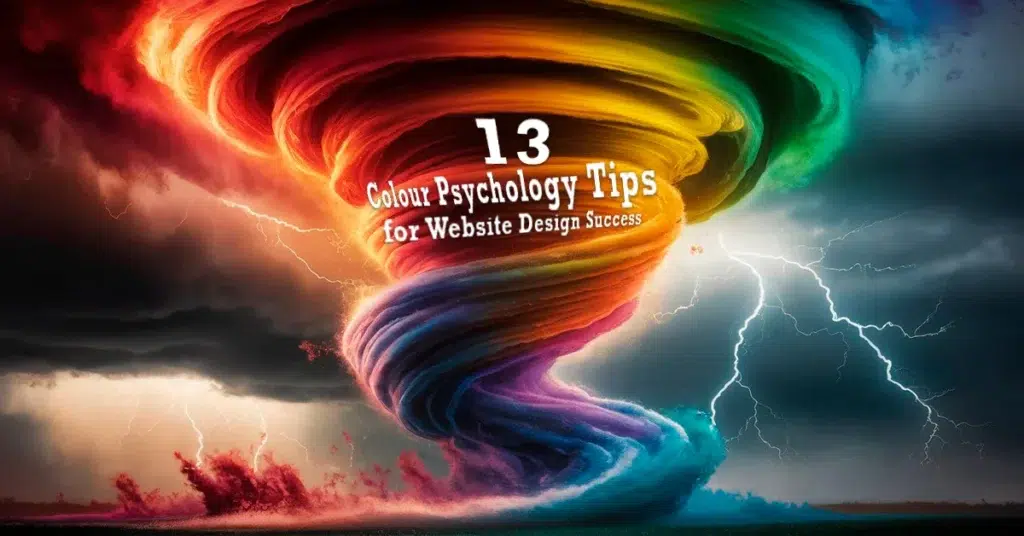
In the world of web design, understanding the significance of colour psychology web design is paramount. The selection of hues goes beyond mere aesthetics; it deeply influences user behaviour and emotions. By strategically incorporating colours, web designers can evoke specific feelings and prompt desired actions from visitors. This introduction sets the stage for delving into 13 expert tips that will elevate your website’s color scheme and design to new heights.
Understand the Basics of Colour Psychology Web Design
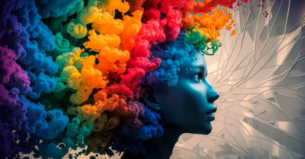
When it comes to web design, understanding the fundamentals of colour psychology is crucial. The colours chosen for a website can have a profound impact on how users perceive and interact with the platform. By delving into the intricacies of colour theory, UI designers can strategically leverage different hues to evoke specific emotions and responses from visitors.
Exploring the psychology of colour meanings reveals its significant influence on user behaviour. colours have the power to subconsciously guide individuals towards certain actions or decisions when navigating a website. Understanding this psychological aspect allows designers to create an environment that resonates with users on a deeper level.
Influence on User Behaviour
The selection of colours in web design can directly affect how users engage with a site. For instance, warm tones like red and orange may elicit feelings of excitement and urgency, prompting visitors to take immediate action, especially when combined with effective color contrast to enhance readability. On the other hand, cool colours such as blue and green are often associated with calmness and balance, fostering a sense of trust and relaxation among users.
Emotional Impact
Colours possess the ability to evoke specific emotions based on their psychological associations. For example, vibrant shades like yellow and orange are commonly linked to energy and enthusiasm, creating a lively and dynamic user experience. By strategically incorporating these emotionally charged hues, web designers can craft websites that resonate with their target audience on an emotional level.
Basics Meanings of Colour Theory
To master colour psychology in web design, one must first grasp the basics of colour theory. This foundation serves as a roadmap for selecting harmonious colour palettes that effectively communicate brand messaging and enhance user experience. A well-chosen color psychology palette not only enhances user engagement but is also instrumental in establishing a brand’s identity and fostering customer loyalty.
Primary, Secondary, and Tertiary colours
Understanding the distinctions between primary (e.g., red, blue, yellow), secondary (e.g., purple, green, orange), and tertiary colours (e.g., teal, magenta) is essential for creating visually appealing websites. By leveraging these colour categories thoughtfully, UI designers can establish visual hierarchy and draw attention to key elements on a webpage.
Warm vs. Cool Colours
The differentiation between warm colours (e.g., reds, oranges) and cool colours (e.g., blues, greens) plays a pivotal role in setting the tone for web design. Warm hues tend to evoke feelings of passion and energy, ideal for brands seeking to make a bold statement. In contrast, cool tones exude tranquillity and sophistication, making them suitable for businesses aiming to convey professionalism and reliability.
Choose a Colour Scheme for Your Website
When it comes to web design, high-valued web designers choose their colour schemes meticulously. The selection of colours and color combinations is not merely a visual decision but a strategic one that can significantly impact user experience and engagement. By understanding the psychology behind colours and how they influence human emotions and behaviours, web designers can create websites that resonate with their audience on a profound level.
Steps to Choose a Colour Scheme
Understand Your Brand
Before delving into the vast colour wheel of possibilities, web designers must first understand the essence of their brand. UI designers choose colours that align with the brand’s identity, values, and message. Whether aiming for a bold and vibrant look or a more subtle and sophisticated feel, selecting colours that reflect the brand’s personality is crucial in establishing a cohesive visual identity.
Consider Your Audience
In the realm of web design, catering to the target audience is paramount. When choosing a colour scheme for a website, web designers choose colours that resonate with their specific demographic. Understanding the preferences, tastes, and psychological responses of the target users can guide designers in selecting hues that evoke the desired emotions and actions. By considering the audience’s perspective, UX designers can create an immersive online experience tailored to meet users’ needs.
Tools for Choosing Colour Schemes
Online Color Palette Tools
In today’s digital age, valuable web designers choose from an array of online tools to aid them in selecting the perfect colour color scheme for their websites. Online colour palettes offer a wide range of pre-selected colour combinations curated by design experts. These tools provide inspiration and guidance for UI designers looking to create visually appealing websites that captivate audiences. By exploring different colour palettes online, UI designers can discover unique combinations that enhance their designs and elevate user engagement. Additionally, understanding the color wheel can help designers select harmonious color schemes, such as complementary and analogous combinations, which impact the overall aesthetic and emotional response in web design.
Design Software
For more advanced customization options, design software serves as a valuable resource for valuable web designers seeking complete control over their colour schemes. Programs like Adobe Photoshop and Illustrator enable designers to create custom colour palettes tailored to their brand’s aesthetic. With features such as colour pickers, swatch libraries, and gradient tools, design software empowers designers to experiment with various hues and tones until they find the perfect combination. By utilising these tools effectively, web designers can bring their creative vision to life through harmonious colour schemes that leave a lasting impression on visitors.

Use Blue for Trust and Calmness
When it comes to web design, the colour blue holds a special place for evoking feelings of trust and calmness among users. This serene hue has the power to instil a sense of reliability and professionalism, making it a popular choice for various industries seeking to establish credibility and foster a sense of security.
Psychological Effects of Blue
In the realm of colour psychology website design, blue is often associated with qualities such as calmness and reliability. Its soothing nature can create a tranquil environment that promotes trust and a sense of stability among website visitors.
Calmness and Reliability
The colour blue exudes a calming effect on individuals, helping to reduce stress and anxiety levels. When incorporated into web design, this serene hue can create a harmonious user experience that encourages relaxation and clarity. By utilising shades of blue strategically, designers can cultivate an atmosphere of tranquillity that resonates with users seeking peace of mind.
Trust and Professionalism
One of the key psychological effects of blue is its ability to convey trustworthiness and professionalism. Websites that feature shades of blue in their colour schemes are often perceived as reliable and authoritative by users. This association with trust can enhance brand credibility and establish a positive reputation among visitors, ultimately leading to increased engagement and loyalty.
Best Practices for Using Blue
When integrating blue into web design, it is essential to consider best practices that maximise its impact on users. By understanding how to leverage this versatile colour effectively, UI/UX designers can harness its potential to enhance user experience across various industries.
Industries That Benefit
Numerous industries can benefit from incorporating blue into their website designs due to its universal appeal and positive connotations. Sectors such as finance, healthcare, aviation, technology, and education often utilise shades of blue to convey reliability, security, and professionalism. By aligning with these industry standards, websites can establish themselves as trustworthy sources of information while fostering strong relationships with their target audience.
Combining Blue with Complementary Colors
While blue holds its own significance in web design, combining it with complementary colors can amplify its impact on users. Pairing blue with hues like white or grey can enhance its calming effect while creating a clean and sophisticated aesthetic. On the other hand, incorporating accents of yellow or orange alongside blue can inject energy and warmth into the design, striking a balance between professionalism and creativity.

Incorporate Red for Energy and Urgency
When it comes to web design, the colour red serves as a powerful tool for evoking feelings of energy and urgency among users. This vibrant hue has the ability to captivate attention and instill a sense of passion and excitement, making it an ideal choice for brands looking to make a bold statement in the digital landscape.
Psychological Effects of Red
Energy and Passion
Red is synonymous with energy and passion, igniting a sense of vitality and enthusiasm in those who encounter it. The boldness of this hue commands attention and evokes a feeling of dynamism that can drive user engagement on websites. By strategically incorporating red into web design, UI designers can create a visually stimulating environment that sparks interest and motivates action.
Urgency and Attention
The colour red is often associated with urgency and immediacy, prompting users to take notice and act swiftly. Its eye-catching nature makes it an effective tool for highlighting important information or calls to action on websites. Whether used in buttons, banners, or alerts, red can create a sense of urgency that compels visitors to pay attention and respond promptly.
Best Practices for Using Red
Strategic Placement
When integrating red into web design, strategic placement is key to maximising its impact. Web designers should identify key areas where the colour red can be used to draw attention or convey a sense of urgency effectively. Whether highlighting promotions, discounts, or critical messages, thoughtful placement of red elements can guide user focus and enhance overall engagement.
Combining Red with Other Colours
While red makes a bold statement on its own, combining it with complementary colours can amplify its effects in web design. Pairing red with neutral tones like white or gray can create a striking contrast that emphasises the vibrancy of the hue. Additionally, blending red with shades of blue or green can balance its intensity with calming elements, creating a harmonious visual experience for users. Another approach is to use monochromatic accent color schemes, which involve various shades, tints, and tones of red to maintain harmony while adding contrast and visual interest.
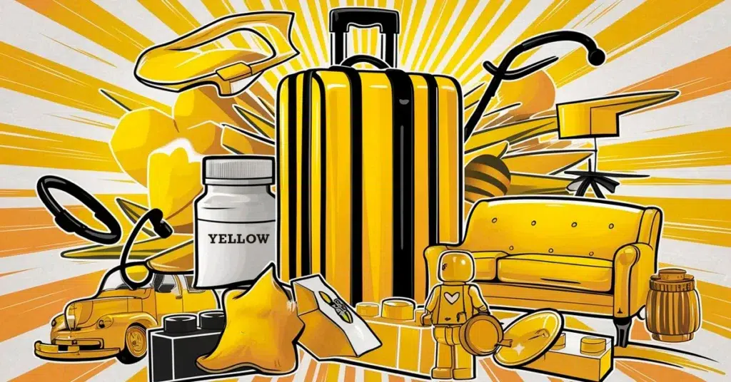
Utilise Yellow for Optimism and Attention
When it comes to web design, the colour yellow radiates a sense of optimism and draws attention like a beacon in the digital landscape. This vibrant hue has the power to evoke feelings of happiness and warmth, creating a welcoming and cheerful atmosphere for website visitors.
Psychological Effects of Yellow
Happiness and Warmth
Yellow is synonymous with joy and positivity, infusing websites with a sunny disposition that uplifts users’ spirits. Its bright and cheerful nature can evoke feelings of warmth and friendliness, making visitors feel welcomed and at ease as they navigate through the site.
Attention-Grabbing
The colour yellow serves as a natural attention-grabber in web design, effortlessly drawing the eye towards key elements on a webpage. Whether used for call-to-action buttons or important notifications, yellow commands focus and prompts users to take notice, guiding them towards essential information or desired actions.
Best Practices for Using Yellow
Balancing Yellow with Other Colours
When incorporating yellow into web design, it is essential to strike a harmonious balance with other hues to create visually appealing colour schemes. Pairing bright yellow together with neutral tones like white or grey can enhance its vibrancy while maintaining a clean and modern aesthetic. Additionally, combining yellow with complementary colours such as blue or green can create dynamic contrasts that captivate users’ attention and enhance overall visual impact.
Industries That Benefit
Numerous industries can benefit from harnessing the power of yellow in the colors affect their website designs to convey specific messages or evoke desired emotions among visitors. Sectors such as hospitality, entertainment, and retail often leverage yellow to communicate feelings of energy, creativity, and optimism. By strategically integrating this vibrant hue into their online presence, businesses can establish a lively and engaging brand identity that resonates with their target audience.
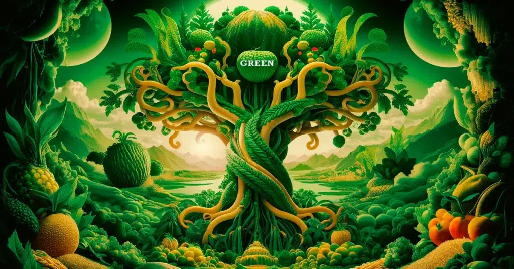
Apply Green for Balance and Growth
In the realm of web design, the colour green serves as a versatile tool for creating harmonious and vibrant online experiences. This refreshing hue is often associated with qualities such as balance, growth, and health, making it a popular choice for brands looking to convey a sense of tranquillity and vitality on their websites.
Psychological Effects of Green
Nature and Tranquility
When users encounter the colour green in web design, they are greeted with a sense of serenity inspired by nature’s lush landscapes. The calming effect of this hue can evoke feelings of peace and relaxation, transporting visitors to a tranquil oasis amidst the digital realm. By incorporating shades of green strategically, designers can create an environment that fosters mental clarity and emotional well-being among users.
Growth and Health
Beyond its association with nature, the colour green symbolises growth and vitality in web design. Its vibrant tones mirror the rejuvenating energy found in flourishing plants and verdant meadows, inspiring feelings of renewal and abundance. Websites that feature shades of green can convey messages of progress, prosperity, and good health to visitors, encouraging them to explore and engage with the content presented.
Best Practices for Using Green
Combining Green with Other Colours
To maximise the impact of green in web design, designers can experiment with various colour combinations that enhance its visual appeal. Pairing green with complementary hues like white or blue can create a crisp and clean aesthetic that exudes freshness and sophistication. Additionally, blending green with accents of yellow, light pink or orange can inject warmth and energy into the design, striking a balance between vibrancy and harmony.
Industries That Benefit
Numerous industries, including human resources, can benefit from integrating green into their website designs to communicate specific messages or evoke desired emotions among users. Sectors such as health and wellness industry, environmental conservation, finance, and agriculture often leverage green to convey themes of balance, growth, sustainability, and prosperity. By infusing their online presence with shades of green, businesses can establish themselves as trustworthy authorities in their respective fields while nurturing relationships with their target audience through visually engaging experiences.

Use Orange for Enthusiasm and Creativity
When it comes to web design, the colour orange serves as a vibrant tool for infusing websites with enthusiasm and creativity. This energetic hue has the power to evoke feelings of warmth and fun, creating an engaging and dynamic online experience for users.
Psychological Effects of Orange
Energy and Warmth
Orange is synonymous with energy and warmth, radiating a sense of vitality that captivates users’ attention. Its bold and cheerful nature can uplift visitors’ spirits, infusing websites with a burst of positivity that fosters a welcoming atmosphere. By incorporating lighter and darker shades of orange strategically, web designers can create an environment that exudes passion and excitement, encouraging users to explore and interact with the content presented.
Creativity and Fun
The colour orange is often associated with creativity and fun in web design, sparking imagination and playfulness among visitors. Its playful tones can inject a sense of joy into the user experience, making interactions memorable and enjoyable. Websites that feature hints of orange can inspire innovation and originality, inviting users to engage with content in unique ways that stimulate their creativity.
Best Practices for Using Orange
Strategic Placement
When integrating orange into web design, strategic placement plays a crucial role in maximising its impact on users. Web designers should identify key areas where the colour orange can be used to draw attention or convey a sense of enthusiasm effectively. Whether highlighting interactive elements, promotional offers, or creative content sections, thoughtful placement of orange elements can guide user focus and enhance overall engagement.
Combining Orange with Other Colours
While orange makes a bold statement on its own, combining it with complementary colours can amplify its effects in web design. Pairing orange with neutral tones like white or gray can create a striking contrast that emphasises the vibrancy of the hue. Additionally, blending orange with shades of blue or green can balance its intensity with calming elements, creating a harmonious visual experience for users.
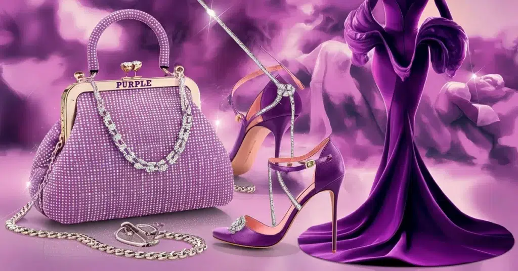
Incorporate Purple for Luxury and Creativity
When it comes to web design, the colour purple exudes an air of sophistication and creativity that can elevate the visual appeal of a website. This regal hue is often associated with luxury and royalty, making it a compelling choice for brands looking to convey elegance and innovation in their online presence.
Psychological Effects of Purple
Luxury and Royalty
The colour purple has long been linked to notions of opulence and grandeur, symbolising wealth and extravagance. Its deep and rich tones evoke a sense of luxury that resonates with discerning audiences seeking premium experiences. By incorporating shades of purple into web design, UI designers can create a sense of exclusivity that captivates visitors and positions brands as leaders in their respective industries.
Creativity and Imagination
In addition to its association with luxury, purple also stimulates creativity and imagination in web design. The whimsical nature of this hue sparks innovative thinking and artistic expression, fostering a sense of originality that sets websites apart from the competition. By infusing elements of purple strategically, web designers can inspire users to explore new ideas and engage with content in imaginative ways that leave a lasting impression.
Best Practices for Using Purple
Industries That Benefit
Numerous industries can benefit from integrating purple into their website designs to communicate specific messages or evoke desired emotions among users. Sectors such as fashion, beauty, art, and entertainment often leverage purple to convey themes of luxury, creativity, and sophistication. By incorporating this regal hue into their online branding, businesses can establish a strong visual identity that resonates with their target audience while differentiating themselves from competitors.
Combining Purple with Other Colours
To maximise the impact of purple in web design, UI designers can experiment with various colour combinations that enhance its visual appeal. Pairing purple with complementary hues like gold or silver can create an elegant aesthetic that exudes glamour and refinement. Additionally, blending purple with accents of white or black can create striking contrasts that emphasise the richness of the hue while maintaining a modern and sophisticated look. By harmonising purple with other colours thoughtfully, web designers can create captivating websites that embody luxury and creativity in every detail.
Use Black for Sophistication and Elegance
When it comes to web design, the colour black exudes an air of sophistication and elegance that can elevate the visual appeal of a website. This timeless hue is often associated with qualities such as power, authority, and mystery, making it a compelling choice for brands looking to convey a sense of luxury and refinement in their online presence.
Psychological Effects of Black
Power and Sophistication
The colour black holds a commanding presence in web design, symbolising power and sophistication. Its deep and rich tones evoke a sense of authority that resonates with discerning audiences seeking premium experiences. By incorporating shades of black into the colour palette, web designers can create a sense of exclusivity that captivates visitors and positions brands as leaders in their respective industries.
Elegance and Mystery
In addition to its association with power, black also exudes an aura of elegance and mystery in web design. The enigmatic nature of this hue sparks curiosity and intrigue among users, inviting them to explore hidden depths within the website. Websites that feature hints of black can convey an air of sophistication that intrigues visitors and leaves a lasting impression long after they have navigated through the pages.
Best Practices for Using Black
Strategic Placement
When integrating black into web design, strategic placement plays a crucial role in maximising its impact on users. UI designers should identify key areas where the colour black can be used to create focal points or add dramatic flair effectively. Whether highlighting important content sections or creating visual contrast between elements, thoughtful placement of black elements can guide user attention and enhance overall engagement.
Combining Black with Other Colours
While black makes a bold statement on its own, combining it with complementary colours can amplify its effects in web design. Pairing black with neutral tones like white or gray can create a sleek and modern aesthetic that exudes sophistication. Additionally, blending black with accents of gold or silver can add a touch of glamour and luxury to the design, elevating the overall visual appeal for users.

Utilise White for Simplicity and Cleanliness
When it comes to web design, the colour white serves as a timeless canvas that embodies simplicity and cleanliness, creating a minimalist aesthetic that resonates with modern audiences. This pristine hue has the power to evoke feelings of purity and clarity, offering users a visually soothing experience that enhances content legibility and navigation efficiency.
Psychological Effects of White
Simplicity and Cleanliness
The colour white is synonymous with simplicity and cleanliness in web design, symbolising purity and freshness that captivates users’ attention. Its crisp and uncluttered appearance creates a sense of order and organisation, making websites appear sleek and professional. By incorporating white strategically, web designers can establish a harmonious visual hierarchy that guides users through content seamlessly, promoting a sense of tranquillity and focus.
Space and Clarity
In addition to its association with simplicity, white also conveys a sense of spaciousness and clarity in web design. The expansive nature of this hue creates visual breathing room within layouts, allowing content to stand out effectively without distractions. Websites that feature ample white space exude an air of sophistication that enhances user engagement by reducing cognitive overload. By leveraging the clarity of white, web designers can craft interfaces that prioritise information hierarchy and readability for optimal user experience.
Best Practices for Using White
Strategic Placement
When integrating white into web design, strategic placement plays a crucial role in maximising its impact on users. UI Designers should identify key areas where the colour white can be used to create focal points or enhance visual appeal effectively. Whether highlighting essential text sections or emphasising call-to-action buttons, thoughtful placement of white elements can draw user attention towards critical elements while maintaining an elegant and clean design aesthetic.
Combining White with Other Colours
While white shines on its own as a primary colour choice, combining it with complementary hues can elevate its effects in web design. Pairing a white background with accents of black or gray can create a sophisticated monochromatic palette that exudes elegance and timelessness. Additionally, blending white with pops of vibrant colours like blue or green can inject energy and personality into the design, adding visual interest while maintaining a clean overall look. By harmonising White with other colours thoughtfully, web designers can create captivating websites that balance simplicity with creativity for an engaging user experience.

Understand Cultural Differences in Colour Perception
Importance of Cultural Sensitivity
Different Meanings in Different Cultures
Understanding the nuances of colour perception across various cultures is paramount in creating a globally inclusive web design. Colours hold diverse meanings and interpretations based on cultural contexts, influencing how individuals from different backgrounds perceive and interact with websites. By acknowledging these variations, web designers can ensure that their colour choices resonate positively with a diverse audience.
Avoiding Misinterpretations
Misinterpretations stemming from cultural differences in colour perception can lead to unintended consequences for websites. colours that symbolize positivity in one culture may carry negative connotations in another, potentially alienating users or causing misunderstandings. To prevent such pitfalls, UI/UX designers must conduct thorough research on cultural colour symbolism to avoid inadvertently offending or confusing visitors from different regions.
Psychological Effects of White
Simplicity and Cleanliness
The colour white is synonymous with simplicity and cleanliness in web design, symbolising purity and freshness that captivates users’ attention. Its crisp and uncluttered appearance creates a sense of order and organisation, making websites appear sleek and professional. By incorporating white strategically, web designers can establish a harmonious visual hierarchy that guides users through content seamlessly, promoting a sense of tranquillity and focus.
Space and Clarity
In addition to its association with simplicity, white also conveys a sense of spaciousness and clarity in web design. The expansive nature of this hue creates breathing room within layouts, allowing content to stand out effectively without distractions. Websites that feature ample white space exude an air of sophistication that enhances user engagement by reducing cognitive overload. By leveraging the clarity of white, web designers can craft interfaces that prioritise information hierarchy and readability for optimal user experience.
Best Practices for Global Websites
Researching Target Audiences
In the realm of global web design, thorough research on target audiences is essential for creating culturally sensitive colour schemes. By understanding the preferences, values, and symbolic associations of different cultures, designers can tailor their colour choices to resonate with specific demographics effectively. Conducting surveys, focus groups, and market analyses can provide valuable insights into the colour preferences of diverse audiences, guiding designers in selecting hues that foster positive user experiences.
Adapting colour Schemes
Adapting colour schemes to align with cultural preferences is key to ensuring the success of global websites. Web designers should be mindful of regional differences in colour symbolism and adjust their palettes accordingly to accommodate diverse audiences. By incorporating culturally relevant colours and avoiding those that may be perceived negatively, websites can establish connections with users worldwide and convey messages that resonate harmoniously across borders.
By embracing cultural sensitivity in colour perception, web designers can create inclusive and engaging online experiences that transcend geographical boundaries. Through meticulous research and thoughtful adaptation of colour schemes, websites can bridge cultural divides and foster meaningful connections with a diverse range of users globally.
Test and Optimise Your Colour Choices. Use colour to Solve Problems
In the realm of web design, the process of testing and optimising colour choices plays a pivotal role in enhancing user experience and driving desired outcomes. By leveraging color psychology principles, web designers can strategically select hues that resonate with their target audience and evoke specific emotions or behaviours. Through rigorous testing methodologies and user feedback mechanisms, web designers can fine-tune their colour palettes to address usability issues, improve engagement metrics, and ultimately solve design problems effectively.
Importance of Testing
A/B Testing
A/B testing, also known as split testing, is a fundamental technique used by designers to compare two versions of a webpage with differing colour schemes. By presenting variations to different segments of users and analysing their responses, designers can identify which colour combinations yield optimal results in terms of user engagement and conversion rates. A/B testing provides valuable insights into how colours impact user behaviour, allowing designers to make data-driven decisions that enhance the overall effectiveness of their designs.
User Feedback
User feedback serves as a valuable source of information for evaluating the impact of colour choices on user perception and interaction. By soliciting feedback through surveys, interviews, or usability tests, web designers can gain valuable insights into how users interpret colours within a website context. Understanding users’ preferences, emotional responses different emotions, and pain points related to colour usage enables web designers to make informed adjustments that address usability issues and align with user expectations effectively.
Tools for Testing Colours
Analytics Software
Analytics software offers UX designers powerful tools for tracking user behavior and interactions with different colour elements on a website. By analysing metrics such as click-through rates, bounce rates, and conversion rates associated with specific colour variations, UX designers can assess the performance of their designs objectively. Analytics software provides quantitative data that illuminates the impact of colour choices on user behaviour, enabling designers to optimise their designs based on empirical evidence rather than subjective opinions.
User Testing Platforms
User testing platforms facilitate direct engagement with target users to gather real-time feedback on colour preferences and perceptions. By conducting usability tests or remote user sessions focused on colour-related aspects of a design, designers can observe how users navigate interfaces, interpret visual cues, and respond emotionally to different colour stimuli. User testing platforms offer qualitative insights that complement quantitative analytics data, providing a comprehensive understanding of how colours influence user experiences across diverse demographics.
Keep Up with Colour Trends and Select Winning colours
In the ever-evolving landscape of web design, staying updated on the latest colour trends is essential for web designers looking to create visually impactful and engaging websites. By embracing industry trends and seasonal influences, web designers can leverage the power of colour to captivate audiences and convey brand messages effectively.
Remember the Importance of Staying Updated
Industry Trends
Staying abreast of industry trends in colour usage can provide valuable insights into emerging palettes and design preferences across various sectors. Web designers who monitor industry-specific colour schemes can adapt their designs to align with current market demands and consumer expectations. By incorporating trending colours into their palettes, web designers can ensure that their websites remain relevant and appealing to target audiences.
Seasonal Trends
Seasonal changes often bring about shifts in colour preferences and thematic inspirations that can influence user behavior and design choices. UI designers who embrace seasonal trends can infuse their websites with timely aesthetics that resonate with users during specific times of the year. Whether incorporating warm tones for a cozy winter feel or vibrant hues for a lively summer vibe, adapting colour schemes to reflect seasonal nuances can enhance user engagement and create memorable online experiences.
Resources for Colour Trends
Design Blogs
Design blogs serve as valuable resources for designers seeking inspiration and guidance on current colour trends. These online platforms feature curated content on colour theory, palette recommendations, and real-world examples of successful colour implementations in web design. By following reputable design blogs, UI/UX designers can stay informed about cutting-edge colour strategies, innovative combinations, and best practices for integrating trending hues into their projects.
Trend Reports
Trend reports offer comprehensive analyses of prevailing colour trends in various industries, providing designers with actionable insights into popular palettes and emerging colour schemes. These reports highlight key themes, forecasted colour directions, and influential factors shaping design choices across different sectors. By referencing trend reports from reputable sources, web designers can anticipate future shifts in colour preferences, make informed decisions about their design strategies, and select winning colours that resonate with contemporary audiences.
In the realm of web design, colour psychology plays a pivotal role in creating visually captivating and engaging websites. By understanding how different hues promote specific emotions and behaviours, web designers can craft online experiences that resonate with users on a profound level. The 13 expert tips on web design color psychology outlined in this blog provide valuable insights into leveraging colour effectively to enhance user experience and drive desired outcomes. Web designers are encouraged to apply these tips diligently to achieve website design success and establish strong connections with their target audience. Continuous learning and adaptation to evolving colour trends are essential for staying ahead in the dynamic landscape of web design.