Websites have proven to be invaluable resources, especially in the ongoing COVID-19 pandemic. With so many businesses barely surviving to meet their bottom line, many have resolved to take to online marketing and implement sales strategies through the website or e-commerce.
Website design has increasingly become a beacon of hope for business owners around the world. Many had literally felt its intangible visibility yet able access to larger audiences, target markets and getting back to business as usual.
It remains an excellent tool to reduce running costs because most services and operations are made through online meetings. Additionally, it offers great convenience as one can work from home.
With these great benefits and more, here are some mistakes you should avoid when building or optimizing your website according to the latest website design trends 2021 list.
11 Web Design Malaysia Trend Mistakes You Should Avoid in 2021
1. Non-Mobile Friendly Web Design
On average, 70% of all online searches in Malaysia are performed using smartphones, as mobile searches tend to last longer than desktop searches. Mobile responsive web design trends may be attributed to its portability and affordability to a larger percentage of the population in comparison to desktop devices.
A non-mobile-friendly web design will definitely hinder the efforts of potential clients to access your site information, consequently, leading to the loss of opportunity to tap into a potential market.
2. Slow Loading Page
Slow loading pages can be both frustrating and time-consuming to any person searching online, and thus create a negative customer experience. People desire to always have quick and effective search results.
Slow loading pages inhibit consumers from quickly transiting between pages to sample all the needed information, content or images.
3. Poor Website Navigation
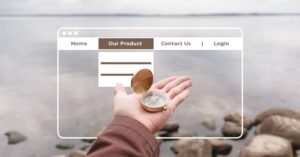
Website navigation enables you to guide your reader’s path. Professional web designers usually incorporate an array of features to enable ‘intuitive navigation design’. This form of navigation helps a visitor to access the needed website pages with ease and direct.
On the contrary, a poor design website navigation will lead to many potential users getting ‘stranded’ – clueless about getting to the products pages from the webpage they currently are on.
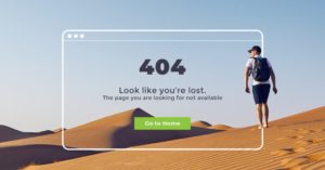
4. No 404 page
Surprisingly these were not part of the web design trends until recently. A 404 page is popularly referred to as a ‘Not Found’ page. It could either caused by the content was moved to other pages, link changed or being deleted. Information on this 404 page is essential to redirect users back to the home page or even better, suggest what is the closest to what they are looking for. No proper 404 design or information will lead to potential customers exit.
Protip: A simple button to link back to the homepage will help in your SEO ranking.
5. Missing H1 tags-Especially on the Homepage
An H1 tag or Heading tag is a title affixed to any piece of content. It’s the headline used to introduce the content as descriptive as possible. This feature helps the users to determine the context of the section before reading it and it has positive effects on the level of your SEO ranking to rank higher than your competitors.
Missing H1 tags will inevitably decrease your ranking and lead to a ‘puzzled’ audience, who may not precisely be getting the best idea of what they are viewing.
6. Large Image File Sizes
Images are the face of any website. It increases the aesthetic value of the website, draws attention and fosters engagement with your customers. In turn, they attract more organic traffic to your site and increase your SEO rank.
However, inserting large image file sizes may limit the enjoyment of these benefits, despite challenging for the best quality. Some creative agency still tends to ignore this fact.
Large images may take up lots of web space and slow down your website. For all our websites projects, our designers usually scan through this Photoshop resizer, to provide the best user experience.
7. Pop-Ups Distractions
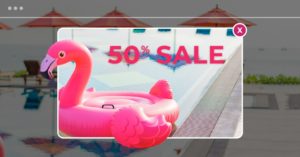
Unless you are really giving 90% off and closing down your store, then this may be a good idea – especially for an e-commerce website.
No people would want their browsing experience to be interrupted with a brands’ pop-up that tells them of a sale or an event coming up, especially if when pop-ups are irrelevant to them. It’s annoying!
8. Text in Images
Text in images may be a great idea to grab the attention of a new brand name among many famous brands. However, this works only during peak branding campaigns and may prove detrimental if overdone. Stuffing images with text and keywords may lead to a lower SEO rank as ‘stuffed’ images may be considered as SPAM. Google algorithms read the embedded metadata and interpret the same. It is important that all branding agency know how SEO works.
9. Infinite Scrolling
A website page can be disavowed from a search engine results because search engines, especially Google, do not scroll through pages that incorporate this feature. Using an infinite scrolling layout on your website leads to the continuity of slow loading of redundant contents.
Essentially, this means content only loads as you scroll. Good website designs should incorporate alternative features such as pagination which enable the webpages to be analyzed and indexed according to the Google bots ways.
10. All Content in 1 Page
Having all your contents squeezed into one page gives a congested look and affects the overall presentation of your website design. Yes, we know it is cheaper for business, but it does not benefit your users.
Well laid out pages should provide information in ‘palatable’ portions. It should include the division of contents into subheadings and using backlinks to link other related webpages to the current one. These features will minimize the risk of putting everything on one page that may diminish customers’ interest due to the difficulty of finding what they desire ‘amidst’ all the clutter.
11. Templated Design
A well-designed website should cater to the exact needs of the company. It should be unique and tailor-made for that type of business. A premade template, however affordable, lacks these features.
Templates are designed to blanket the needs of a company. It lacks versatility and is replicative. A majority of free template designs fail to measure the changing SEO algorithm and prepare to get out of trends in no time. Such a shortcoming will adversely affect your ranking and company plans in the long run.
Conclusion on Web Design Trends Malaysia
In 2021, the internet search and website landscape in Malaysia is bound to be more competitive due to the drastic increase in the number of ‘players’.
Search engines will be more inclined to introduce more stringent and robust algorithms to rank websites. The changes are bound to be fast-paced, continuous, and will have much effect on your website visibility. Instead of worrying about these intricate technicalities, leave it to the experts. Do consider hiring a reputable web design Malaysia company that will build and optimize your website to your exact needs and ensure a continuous high SEO ranking to serve these folks.


