13 Web Design Mistakes To Avoid – Those That We Have Avoided in 2024

In the ever changing world of web design, its not just about looks but about website traffic and brand identity. As we head into 2025 we need to remember that the foundation of a great website is its design. From the best website design inspiration a well designed design not only captures your brand identity but also attracts and retains website traffic.
Knowing and avoiding common mistakes in web design is key to this, so your site resonates with users and your brand message is communicated. Avoiding these design mistakes is also important for your site’s credibility as outdated design and content can undermine trust and drive users away. Here are the mistakes to avoid:
Common Web Design Mistakes To Avoid

Common web design mistakes can damage a website’s user experience, engagement and conversions. A well designed website is essential for a business’s online success, it can increase credibility, trust and sales. But many websites fall victim to common design mistakes that harm their online presence. In this article we will go through the common web design mistakes and provide actionable tips to avoid them.
Severe Inaccessibility Risk in Web Design
Not having an accessible corporate website not only hampers its performance but also damages the user interface. Making the website accessible for assistive technologies is crucial to make it usable for everyone especially for people with disabilities. This can be more critical when dealing with international clients who have different accessibility needs.
Moreover search engine algorithms are favouring accessible website designs so it’s important to have search engine friendly websites. Inaccessible websites are a major threat as they don’t accommodate users with disabilities like those who need keyboard navigation, alt text on images and sufficient colour contrast.
Usability testing is key to finding and fixing accessibility issues so teams can understand real user behaviour and improve overall user experience.
The consequences go beyond poor user experience and can affect search engine rankings and global client engagement. Accessibility and essential design elements is not just about compliance it’s about broad and effective reach in the digital world.
Don’t Let Slow Loading Speeds Kill Your Website

In the 2024 digital landscape where a web design company’s reputation is built on efficiency and user experience ignoring slow loading speeds can be fatal for your website. During development it’s important to prioritise speed to keep your audience engaged and reduce bounce rates especially for mobile users. This is not just about looks it’s a core functionality issue for web pages.
Causes of slow website performance are suboptimal web hosting, bloated code, too many elements like large media files, and over reliance on heavy scripts and plugins. To mitigate these risks web design companies should choose hosting services that offer fast load times and big bandwidth.
During development speed tests should be a regular process. Tools like Google PageSpeed Insights will give you valuable insights on how your website performs under different conditions and will point out specific areas to improve.
And also optimising images and videos for the web without sacrificing the high quality images itself is part of this process. Implementing techniques like lazy loading which delays the loading of non-critical resources at page load time can also boost performance.
Web design companies should treat slow loading speeds as a major threat to website success. By focusing on efficient web hosting, streamlining the development process and monitoring website performance regularly you can ensure your site meets the high speed demands of modern web users. Failing to do so will not only frustrate your visitors but also hurt your own site’s search engine rankings and overall online presence.
Speed is key to user engagement. Optmise media files, use lazy loading and minimise heavy scripts. Tools like Google PageSpeed Insights can monitor your website’s speed.
Don’t Ruin Your Business Website with Non-Responsive Web Design for Mobile Users

Your website should adapt to different screen sizes to provide good user experience on all devices. Modern website design and responsive web design is key. In the ever changing landscape of web development projects the importance of responsive websites can’t be overstated.
For businesses not having a responsive design can be a costly mistake and can derail the effectiveness and reach of their website. As user behaviour shifts more towards mobile and multiple devices website designers must prioritise responsiveness in their designs to have a seamless user experience across all devices.
A non responsive web design is a major pitfall in modern web development and can cause a multitude of problems that can hurt a business website’s performance and user engagement. In a non responsive design images, text and navigation bars will maintain their absolute size and position regardless of the device being used.
This rigidity will result to a frustrating experience for users on mobile devices who will have to scroll horizontally or pinch to zoom on content and ultimately lead to higher bounce rates and lost opportunities.
For web designers the challenge is to create fluid and adaptable layouts that will respond to different screen sizes and resolutions of devices. This means a thoughtful approach to web development with flexible grids, scalable images and media queries that will adjust the layout based on the device’s capabilities and screen size.
By doing so responsive websites not only improve user experience but also benefits to the site’s SEO as search engines like Google favours mobile friendly sites in their algorithms.
Ignoring the need for responsive design in web development projects is a risk that businesses can’t afford. It’s not just about looks; it’s a part of the website’s functionality and its ability to serve its target audience. As the digital world evolves responsive web design has gone from nice to have to must have for any business website with seo.
Sacrificing User Experience For Looks, Especially For Mobile Devices
One of the most common web design mistakes is sacrificing user experience for looks. A website looks important but not at the expense of usability. A website that prioritises looks over function will result to a bad user experience and high bounce rates and low engagement. To avoid this mistake web designers should balance looks and usability so the website is both looks good and easy to use.

Don’t Ruin Your Site with Vague Calls-To-Action!
In the competitive digital landscape, web design mistakes often stem from unclear and non-actionable Calls-To-Action (CTAs), which are essential for guiding website visitors and driving conversions. Especially in a bustling digital market like Malaysia, creating a high-converting website goes beyond aesthetics and smooth navigation. A critical yet frequently overlooked aspect is the effectiveness of your CTAs. Generic CTAs can be detrimental, leaving users confused and unsure about their next steps.
To elevate your website from good to great, it’s crucial to incorporate explicit, action-oriented language in your CTAs. This approach not only guides users effectively but also aligns with the dynamic goals of your web development services. Whether prompting users to explore your portfolio, contact your team, or learn more about your services, CTAs on landing pages should be clear and compelling. By doing so, you transform passive visitors into active participants, a vital strategy for any Malaysia website design company aiming to create truly engaging and high-converting websites.
Crafting Engaging User Journeys with Precise CTAs
To avoid the common web design mistake of generic CTAs, it’s essential to focus on crafting engaging user journeys. Precise and compelling CTAs are the backbone of a successful website, as they guide users through the desired actions seamlessly. By using language that resonates with your target audience and reflects your brand’s unique value proposition, you can significantly enhance user engagement.
This strategy not only improves the user experience but also boosts conversion rates, turning visitors into loyal customers. In the ever-evolving world of web design, especially in Malaysia’s competitive market, ensuring your CTAs are clear and purposeful is a game-changer. It transforms your website into a powerful tool for achieving business objectives, fostering user satisfaction, and ultimately driving growth.
Be Careful With Vague Messaging: A Web Design Mistake

Communicate Your Brand's Unique Value
Effectively conveying your unique value proposition is essential in web design, as vague messaging can undermine both personal and business websites. A well-crafted corporate website should deliver clear, valuable information that aligns with your branding strategy. When your website content fails to communicate your brand’s offerings, it leaves visitors puzzled and unsure about what you provide.
This lack of clarity isn’t just a minor oversight; it’s a significant flaw that can drive potential customers away, resulting in lost engagement and opportunities. To prevent this, ensure your website delivers a compelling message from the outset, showcasing your brand’s unique value and purpose. This approach is crucial for capturing and maintaining users’ attention, transforming your web design from a confusing puzzle into a beacon of clarity and professionalism.
Establish a Compelling Online Presence
A clear and compelling message is vital to attract and retain users, turning your website into a professional and authoritative online presence. When visitors arrive at your site, they should immediately understand your brand’s value and purpose, which helps in building trust and credibility. By communicating your brand’s unique value proposition effectively, you can enhance user engagement and foster long-term relationships with your audience.
This strategy not only improves user experience but also strengthens your brand’s identity, ensuring your website stands out in the competitive digital landscape. Prioritizing clarity and consistency in your messaging will help establish a strong online presence that resonates with your target audience and supports your business goals.
Don’t Get Caught in the Trap of Cluttered Interface
Enhance Your Layout with Strategic Use of White Space
In the realm of corporate web design, achieving a clean and organized layout is paramount for improving readability and usability. White space is not merely empty space; it’s a critical design element that helps break up content and gives users a visual rest. This practice not only enhances the overall aesthetic but also guides visitors’ focus to essential elements like content, calls-to-action (CTAs), custom graphics, and branding messages.
Web designers must skillfully balance high-quality visuals with simplicity to avoid cluttered interfaces, which can overwhelm users and detract from the site’s purpose. By thoughtfully incorporating white space, designers can create a professional and accessible website that effectively communicates the brand’s identity.
Avoid the Pitfalls of Cluttered Interfaces
A cluttered interface is a significant web design mistake that can severely impact a corporate website’s effectiveness. When designers attempt to showcase too many elements on a single webpage, the result is often a visually overwhelming and disorganized layout. This not only hinders user engagement but can also dilute the brand’s message.
The key to avoiding this pitfall is to ensure each visual element serves a specific purpose and contributes to the overall narrative of the site. By prioritizing clarity and purpose in design, web designers can craft a user-friendly experience that supports the brand’s goals and enhances the site’s credibility.
Crafting a Balanced and User-Centric Design
Web designers must utilize their technical skills judiciously to create a harmonious balance between visual appeal and functionality. This involves curating visual elements that align with the brand’s story while ensuring easy navigation and accessibility. White space plays a pivotal role in this process, as it helps to organize content and maintain a clean, professional appearance.
By leveraging white space effectively, designers can guide users’ attention to key elements and create an engaging and intuitive user experience. Ultimately, a well-balanced design not only looks appealing but also enhances usability, ensuring the website resonates with its audience and achieves its intended objectives.
Don’t Make Font Size Mistakes in Website Design

Optimize Font Sizes for Mobile Responsiveness
Ensuring your font sizes are readable across all devices is key to avoiding a common design mistake that can hinder user experience. Web designers must pay close attention to font sizes as they significantly impact the overall user experience, interface, and mobile responsiveness. A well-coordinated web design team is essential to implement these elements effectively, ensuring the design remains interactive and user-friendly.
One prevalent design mistake is using font sizes that compromise readability. Text that is too small forces users, especially those on mobile devices, to zoom in, leading to a poor user experience and potential loss of engagement. Conversely, overly large text can disrupt the layout, requiring users to scroll or zoom out to read content comfortably. To achieve a harmonious design, web designers should optimize font sizes for various devices, maintaining a balance that enhances both aesthetics and functionality.
Enhance User Experience with Accessible Font Sizes
To ensure your website is mobile responsive and legible, web designers should adhere to recommended font sizes: 12-16 points/pixels for mobile screens, 15-19 points/pixels for tablets, and 16-20 points/pixels for desktops. This approach guarantees that your website is not only visually appealing but also accessible and user-friendly across all devices.
It’s not just about aesthetics; it’s about crafting an accessible and engaging interface for all users, regardless of their device. Neglecting this crucial aspect of web design can lead to a subpar user experience, ultimately affecting your website’s effectiveness and user engagement. By prioritizing readable font sizes, you create a seamless user experience that supports your site’s design and functionality.
Don’t Make Chunks of Text Overwhelm Your Website
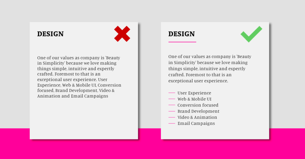
Enhance Readability with Structured Content
In the fast-paced world of website development, overwhelming your audience with large blocks of text is a common web design mistake that can repel visitors rather than attract them. To create engaging and scannable content, web developers must stay updated with the best practices of content presentation and modern web designs.
The key is to break down content into smaller, manageable sections. By utilizing bullet points, subheadings, and ample spacing, you can transform dense text into a compelling narrative that not only enhances readability but also effectively conveys your message. This approach ensures your website content is not only visually appealing but also user-friendly, helping to retain visitors and improve overall user experience.
Avoid the Pitfall of Overwhelming Text
In today’s digital age, where skimming is the norm, big blocks of text can hinder the effectiveness of your message and negatively impact user experience. To avoid this, web developers should focus on creating clear, concise, and well-structured content. Breaking text into shorter paragraphs and using bullet points can make your content more digestible, allowing visitors to absorb information quickly and efficiently.
This method not only improves readability but also keeps your audience engaged, encouraging them to explore your website further. By prioritizing content clarity and structure, you can enhance user experience and ensure your website stands out in the competitive digital landscape.
Create Compelling Content for User Engagement
The power of clear and concise content cannot be overstated in website development. By avoiding the trap of overwhelming text, web developers can create websites that attract and inform, encouraging site visitors to stay longer and absorb the message. Keeping your website content sharp, engaging, and up-to-date is crucial for maintaining user interest and ensuring your site remains relevant in the ever-changing digital landscape.
By focusing on content presentation and readability, you can enhance user engagement and create a positive impression that encourages visitors to return. This strategic approach to content design is essential for achieving success in the digital world.
Don’t Ignore Your Target Market in Web Design and Digital Marketing

Understanding Your Target Audience for Effective Web Design
In the fast-paced world of web design and digital marketing, understanding your target market is crucial for creating an effective website. Overlooking this aspect is a critical mistake that can severely impact your ecommerce website. Hiring a web design specialist can help ensure your site is tailored to your audience while incorporating modern design and SEO best practices. Failing to define your target market not only affects website traffic but also undermines your social media marketing efforts, leading to decreased engagement and conversions.
When your digital marketing services don’t resonate with your desired audience, there’s a disconnect between your ecommerce website’s offerings and your potential customers’ needs or interests. For instance, a website with a youthful, vibrant design and complex navigation may alienate an older audience that prefers simplicity and ease of use. To avoid this pitfall, conduct thorough market research, analyze competitors, and gather insights through customer surveys to understand your target market’s preferences, behaviors, and expectations.
Crafting User Personas for Targeted Engagement
Creating user personas—detailed descriptions of your ideal customers—can guide the design and content of your ecommerce website to align with user expectations. By knowing and catering to your target market, you can optimize your website design and digital marketing strategies to increase website traffic and engagement.
This targeted approach ensures that every aspect of your ecommerce website, from product displays to social media marketing campaigns, is tailored to those most likely to convert. Ultimately, this strategy drives your ecommerce website’s success and enhances your online business. By aligning your website with the needs of your audience, you not only improve user experience but also boost your brand’s credibility and conversion rates.
The Hidden Navigation Consequences
Enhance Navigation for Seamless User Experience
Ensuring that navigation elements are visible and accessible is vital to avoid a common web design mistake that can lead to a poor user experience. A web design company must prioritize clear and intuitive navigation in their design services, especially when dealing with complex content management systems. This aligns with the latest web design trend of creating user-friendly and engaging interfaces for corporate websites. When users struggle to locate navigation elements, it not only impairs their ability to explore and engage with the site but also negatively impacts the website’s overall usability and design.
To prevent this, web designers should ensure that the main menu and other important navigation links are easily visible and accessible. Implementing sticky menus that remain visible as users scroll, or designing intuitive and responsive drop-down menus, can significantly enhance navigation. In content management systems, where the content is vast and complex, effective navigation becomes even more critical, guiding users through various sections and categories seamlessly. Moreover, web design companies should consider the user journey throughout the design process, anticipating user needs and ensuring that all navigation elements are logically placed and consistently visible across different pages and devices.
Prioritize User-Centric Navigation Design
The goal is to create a seamless and frustration-free experience for users, which can, in turn, increase engagement, reduce bounce rates, and potentially boost conversions. Hidden navigation is a critical mistake in web design and website development. Design services, particularly those involving content management systems, must prioritize clear, visible, and user-friendly navigation. This approach not only benefits the user experience but also enhances the website’s performance and the web design company’s reputation.
By focusing on user-centric navigation design, web designers can ensure that their websites are not only visually appealing but also functionally robust, providing users with a smooth and enjoyable browsing experience. This strategic emphasis on navigation clarity and accessibility is essential for maintaining a competitive edge in the ever-evolving digital landscape.
The Deadly Mistake of Ignoring Custom 404 Page Design in Your Web Development
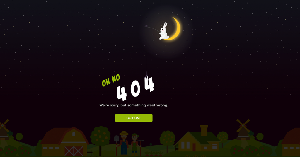
Elevate Your Brand with Customized 404 Pages
In the competitive landscape of web design, overlooking the customization of your 404 page is a common yet impactful mistake, particularly for web development projects in Malaysia. A default 404 page might seem trivial, but it plays a crucial role in shaping user experience and brand perception. When visitors encounter a 404 error, it’s a pivotal moment that can either enhance trust or drive them away.
As a web developer or designer, especially within the Malaysian market known for its high standards, it’s essential to transform this potential frustration into an opportunity for engagement. A custom 404 page that aligns with your overall web design and brand messaging can turn a lost visitor into an intrigued explorer. This attention to detail not only showcases your technical skills but also underscores your commitment to an exceptional user experience, setting you apart in a competitive field.
Showcase Your Expertise with Thoughtful 404 Design
Neglecting the design of your 404 page is more than a missed opportunity; it’s a significant oversight that can undermine your credibility as a web developer. In the eyes of your audience, and particularly in the discerning Malaysian web design market, this can distinguish an amateur from a professional. A thoughtfully designed 404 page reflects your expertise and dedication to user satisfaction, reinforcing your brand’s identity even in unexpected situations.
By customizing your 404 page to maintain branding and infuse creativity, you not only enhance the user experience but also demonstrate a proactive approach to web development. This strategic move can transform a simple error into a memorable interaction, reinforcing trust and encouraging visitors to continue exploring your site.
Web Design Branding Inconsistencies Can Kill Your Online Reputation

The Importance of a Style Guide in Web Design
Using a style guide is essential for maintaining consistency in visual elements, tone, and messaging across your website. Branding inconsistencies pose a significant threat to your online integrity and success. As technology advances rapidly and website design trends evolve, staying updated is crucial. When collaborating with a Malaysia web design agency for design services, prioritize cohesive digital strategies that align with your brand.
This is not merely about aesthetics; it is a necessity. Discrepancies in color schemes, fonts, imagery, and tone of voice can confuse visitors and dilute your brand, creating a disjointed experience that erodes trust and makes your brand less memorable or credible. To address this, enlist the expertise of a professional Malaysia web design agency. These agencies can develop a comprehensive digital strategy that encompasses all aspects of design services, ensuring every element, from the homepage to the footer, aligns with your website’s simplicity and brand identity for a seamless and engaging user experience.
Ensuring Consistent Branding for Online Success
Creating a style guide should be the cornerstone of your digital strategy, governing the use of visual elements, tone, and messaging across all pages and sections of your website. Regular audits are necessary to identify and rectify deviations, maintaining a consistent and strong brand presence. In the digital world, your website often serves as the first point of contact with potential customers. Any inconsistency in web design can mean the difference between building a strong brand connection and losing a visitor to the competition.
Prioritize branding consistency to ensure your website reflects the high-quality imagery and professionalism of your business. By doing so, your online presence will not only be visually appealing but also establish credibility and trust with your audience, ultimately leading to increased engagement and conversions.
No Sign of Trust Indicators and Social Proof

Trust indicators and social proof are part of a website’s design. Trust indicators like security badges and trust seals can establish credibility and trust with the website user. Social proof like customer testimonials and reviews can also build trust and increase conversions. But many websites fail to incorporate these elements properly and can also have issues like broken links, resulting in a lack of trust and credibility. To avoid this mistake web designers should put trust indicators and social proof front and center on the website so users can see and trust the brand.
Non-Secure Site and No Data Protection

A secure site and data protection is part of a website’s design. With cybercrime and data breaches on the rise website users are getting more concerned about their personal data. A website that doesn’t prioritize security and data protection can lose trust and credibility and result to low engagement and conversions. To avoid this mistake web designers should prioritize security and data protection so the website is secure, reliable and compliant to industry standards.
Ignoring Analytics and Data

Harnessing the Power of Google Analytics for Digital Success
In the digital age, utilizing Google Analytics is essential for understanding your website’s performance and making informed decisions. Ignoring the potential of analytics can lead to digital obscurity, as Google Analytics provides invaluable insights crucial for refining your online presence. By examining website design examples, you can draw inspiration and identify standout features that enhance user experience and visual appeal.
In an era where data reigns supreme, overlooking this resource can hinder your website’s ability to attract and retain visitors, ultimately impacting its success. For web agencies and those offering SEO services, analytics is indispensable. Leveraging the vast data from Google Analytics allows you to comprehend user behavior, preferences, and patterns, which is vital for optimizing your website’s design, content, and functionality to align with user expectations and search engine requirements.
The Indispensable Role of Analytics in SEO Strategy
In the realm of search engine optimization (SEO), analytics serves as a treasure trove of information. Google Analytics provides a transparent view of your SEO performance, from tracking user engagement metrics to pinpointing traffic sources. This data is crucial for fine-tuning your tactics, ensuring your website not only ranks higher in search engine results but also delivers a user experience that converts visitors into loyal customers.
For any web agency or business aiming to thrive online, neglecting analytics is akin to navigating without a compass. This oversight can lead to missed opportunities, diminished visibility, and a reduced online presence. By harnessing insights from tools like Google Analytics, you can propel your website forward and achieve success in the ever-evolving digital landscape of 2024.
Web Design Company for Flawless Design and Peak Performance

In conclusion, avoiding web design mistakes in 2024 is crucial to have a website that’s visually appealing and functional and user friendly. Hiring a web design specialist is important to avoid costly mistakes and make sure your website is up to date with modern design trends and SEO best practices. Focus on accessibility, loading speed, responsive design, clear calls-to-action, consistent branding, user experience details like navigation and content readability. Also use data analytics to inform design decisions and keep up with SEO best practices for online visibility and success.
Hiring a web design company can be a smart move to tackle these complexities. A team can fine tune your website (corporate site, personal blog or any other online platform) to meet these standards and make it top performing and stand out online. Their expertise will not only avoid common mistakes but also bring a level of expertise and creativity that can make a big impact to your website.